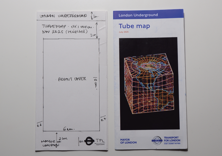
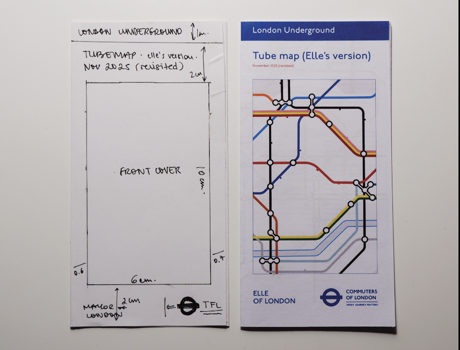
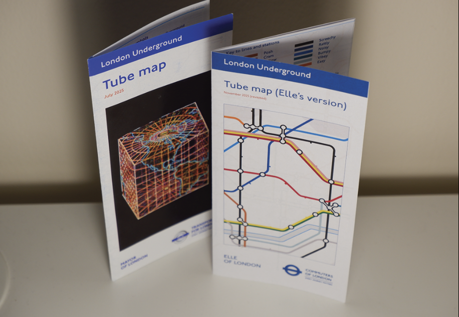
For the second week of the project, I decided to work with the modern TfL pocket map as the medium for my translation. The pocket map felt like the most appropriate format, as it is something people physically interact with while navigating the city. By adopting its structure and dimensions, I could keep a direct relationship with the original object while introducing my own interpretation.
I began by creating a prototype matching the exact dimensions of the official pocket map, using it as a template for my translated version. This allowed me to think not only about the map itself, but also about how it is handled, unfolded, and read. The goal was to keep the familiar physical format while gradually introducing my own system of associations.
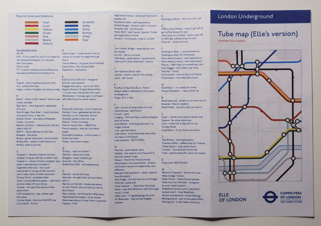
During the final crit, viewers raised an interesting point. While the personalised stations and routes suggested individual experiences of London, it was not always clear what each reference meant. Some viewers were curious about the stories or associations behind the names. Following this feedback, I considered including an index within the publication. The index would allow readers to look up the stations and uncover the meanings behind them, creating a small narrative layer that could encourage people to engage more closely with the map, turn its pages, and potentially start conversations about their own experiences of the city.
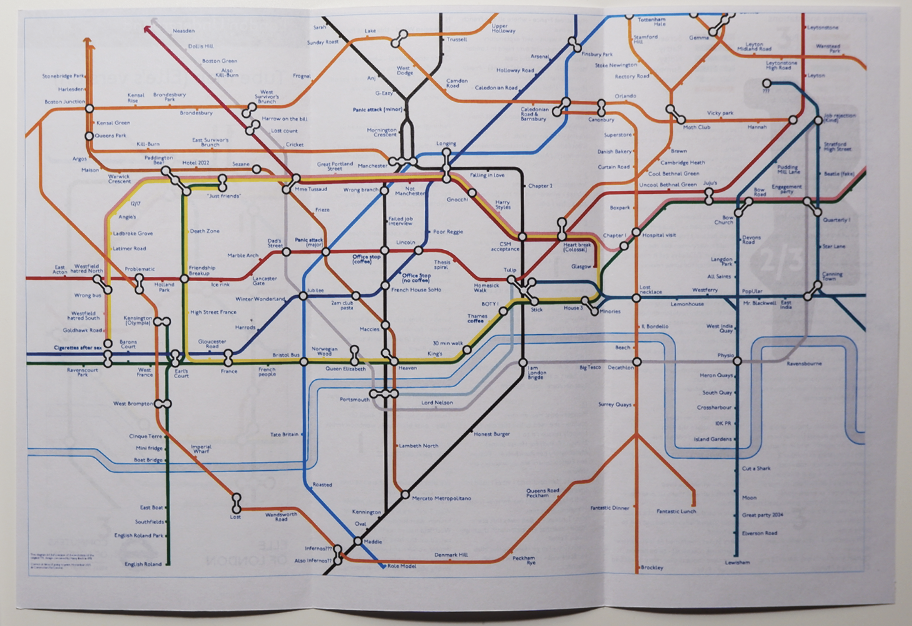
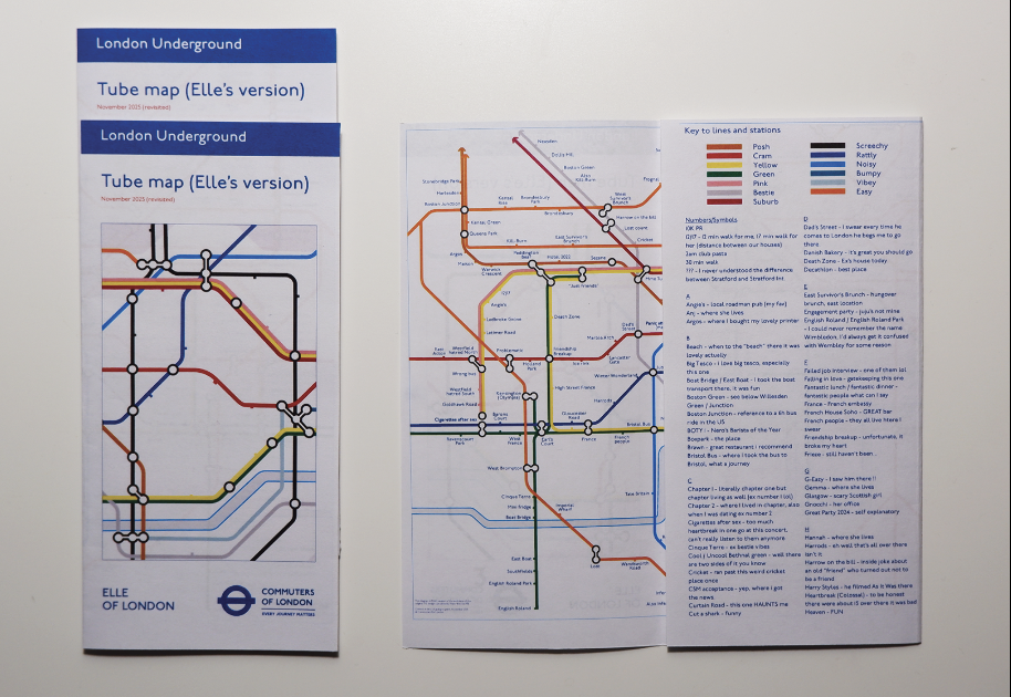
Alongside this, I began experimenting with the visual language of the map itself. One idea that emerged during development was to print the map as a negative, inverting the colours of the original design. Visually, this produced a striking and graphic result, emphasising the diagrammatic qualities of the map. However, it also introduced an unexpected effect. Rather than reinforcing the idea of connection between personal experience and the city’s infrastructure, the inverted map created a subtle sense of distance from the familiar geography of London. The visual language felt more detached from the everyday experience of using the map.
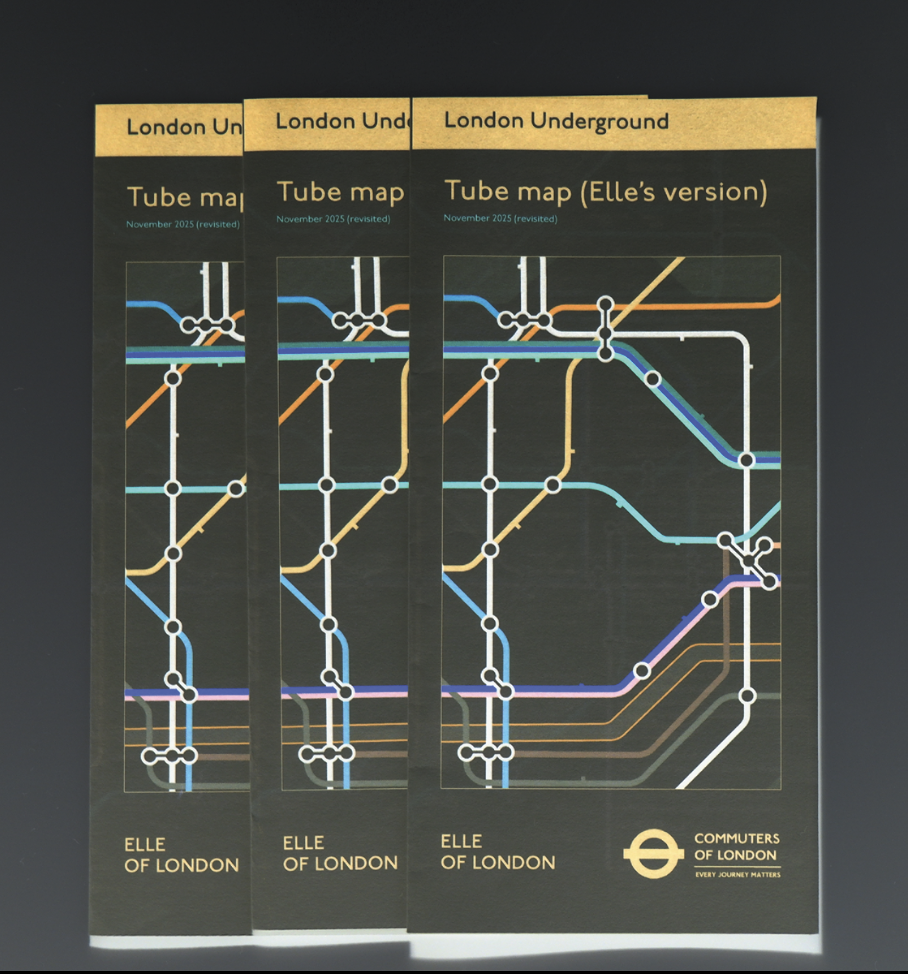
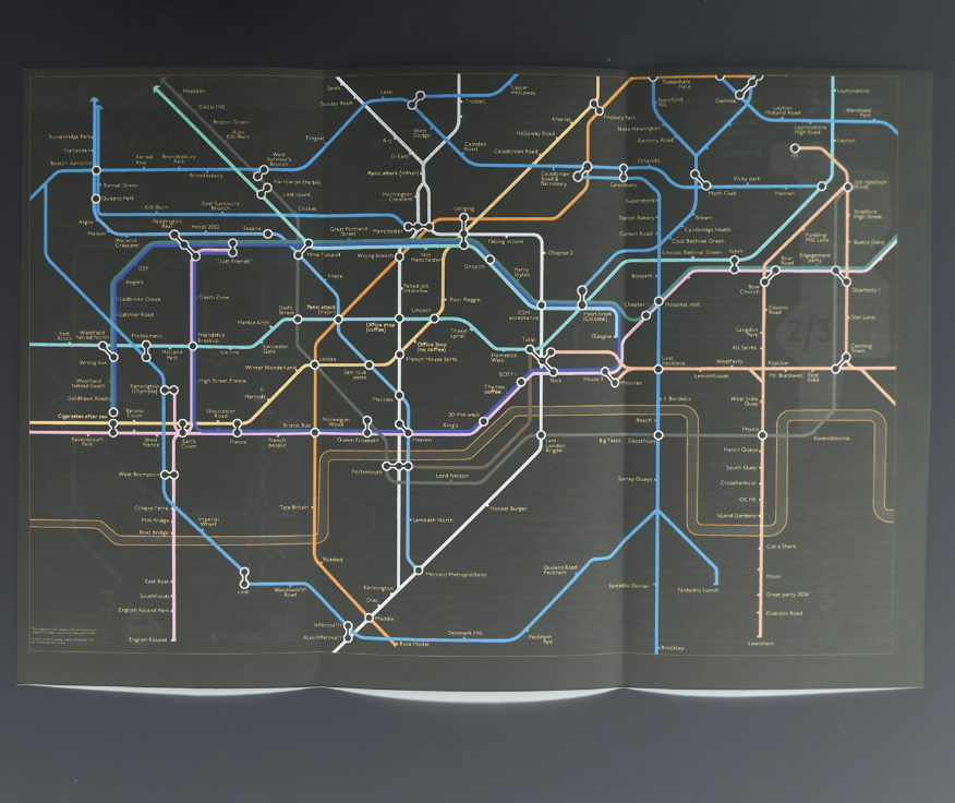
To resolve this, I adopted a hybrid approach. The front cover of the publication “hijacks” the original TfL map by presenting it with inverted colours, allowing my intervention to stand out while still referencing the recognisable visual identity of the system. Once the reader opens the map, however, the design moves closer to the original visual language. This balance allowed the project to introduce a personal reinterpretation while still maintaining a sense of familiarity with the existing transport map.
Final Print;
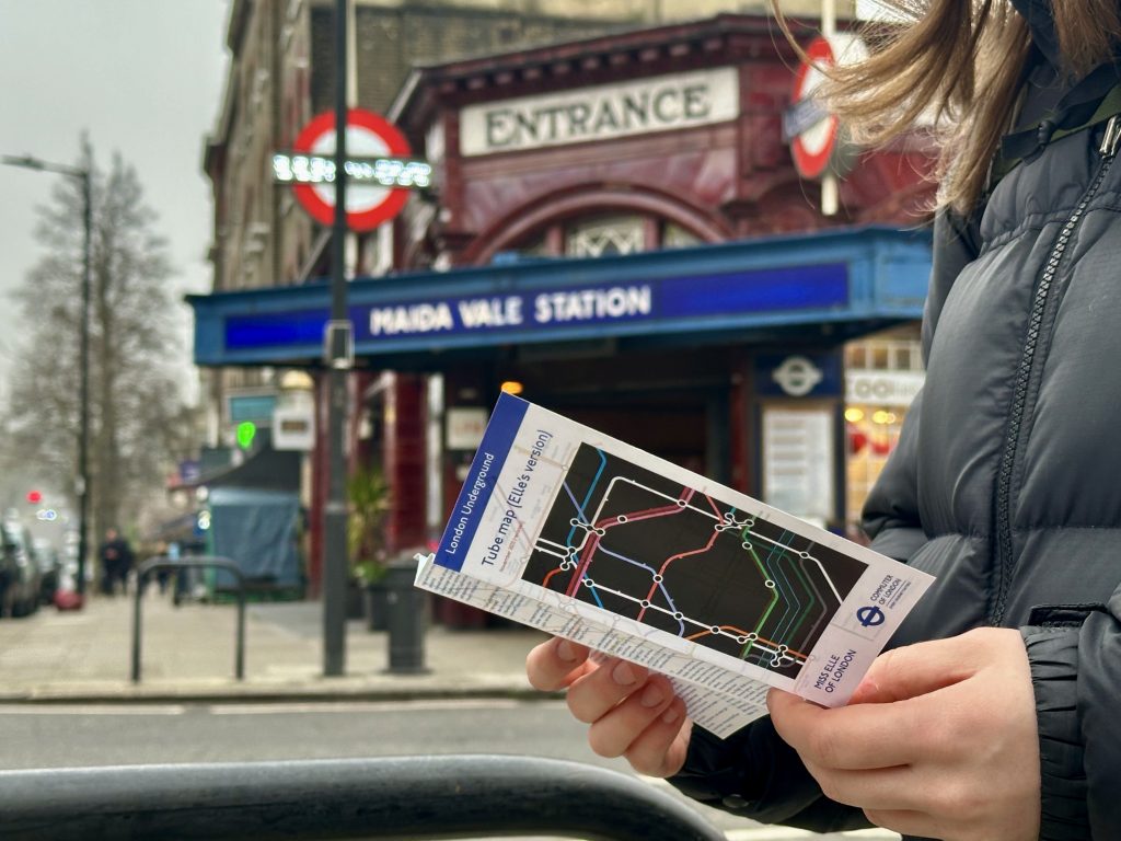
To reinforce the connection to the original map, I also considered the material qualities of the publication. The final iteration was professionally printed on paper with a similar weight and laminated finish, reflecting the materials typically used in transport maps and other commercial print formats.
Further developments;
Developing further, whilst I did not have time to explore the blank map in more detail, it could be interesting to turn it into an installation. The map could be presented as a large blank surface where visitors are invited to draw their own routes, places, and memories, gradually building a collective map shaped by many individual experiences. Over time, the map would evolve into a layered portrait of how different people understand and move through the same city, revealing overlaps, shared routes, and unexpected connections.
The idea could also evolve into a connection-based card game. Each card could represent a station or location, and players would build their own networks by linking cards together. Instead of following the fixed logic of the official TfL map, the game would encourage players to map personal relationships between places, including emotional memories, routines, or encounters. In this way, the map shifts from a tool of navigation to a playful system for sharing experiences and fostering connection between players.
Leave a Reply