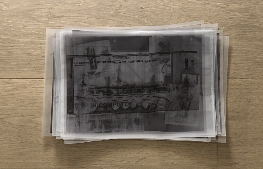
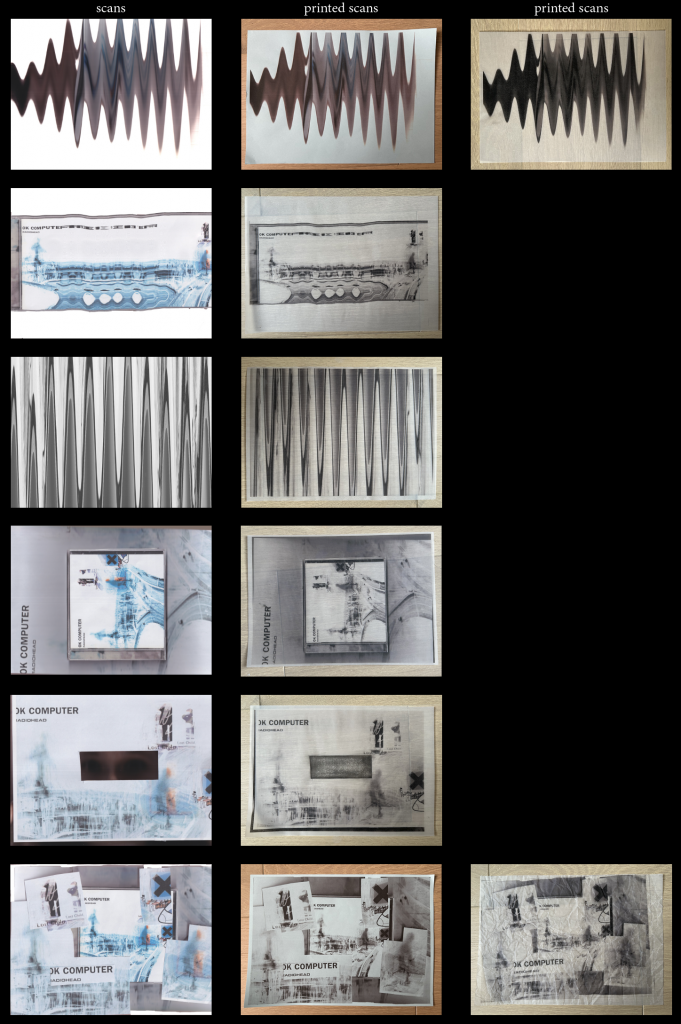
Building on the previous week’s experiments, I began layering the printed scans on top of one another using tracing paper. Rather than producing new distortions through scanning alone, this stage introduced depth through accumulation. Multiple iterations could now coexist within a single image.
As the layers built up, fragments of earlier scans became visible through the tracing paper. The image started to feel less like a single composition and more like a record of the process itself.
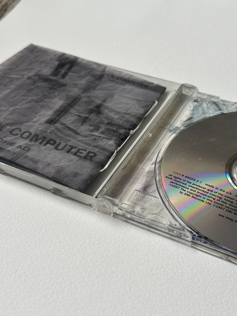
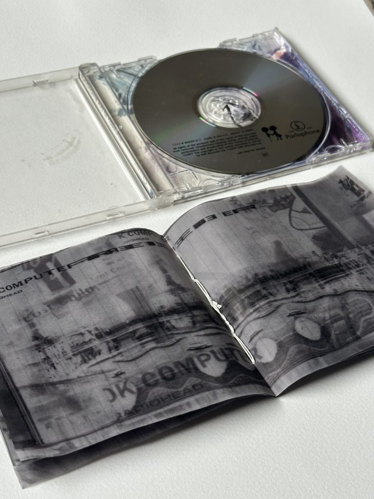
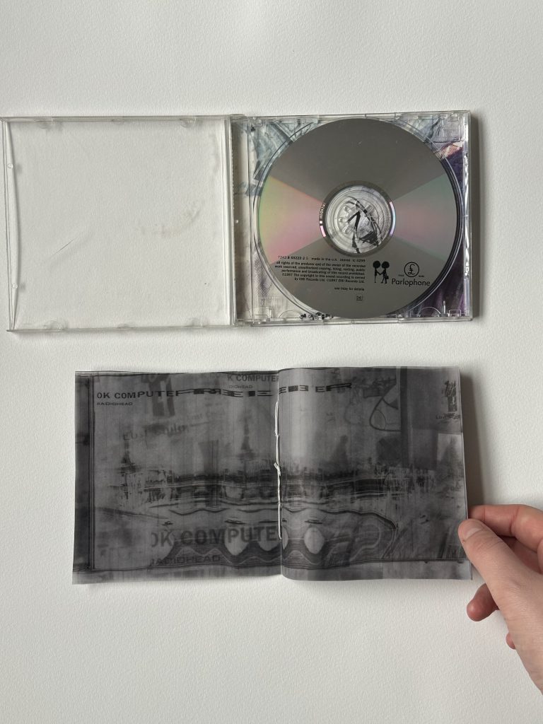
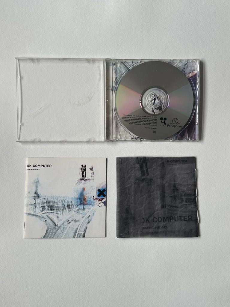
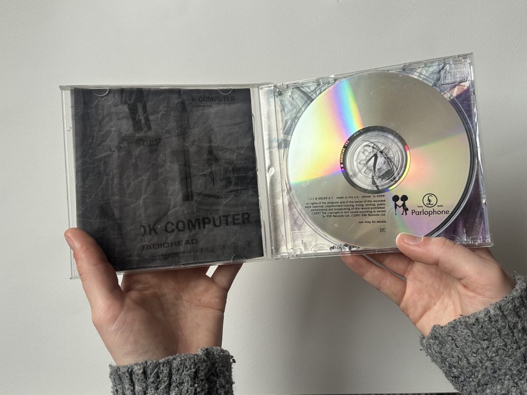
At this point, while looking at the growing stack of printed pages, I had the idea to return the work to its original format. Instead of presenting the iterations as separate images, I decided to reconstruct them as a CD cover.
Using the layered tracing paper prints, I produced a new version of the OK Computer booklet and cover. The distortions created through scanning, printing, and layering were now embedded within the physical structure of the CD case. In this sense, the work returns to its starting point, but transformed through repetition and process.
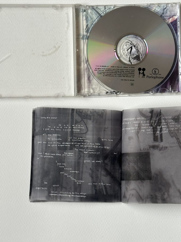
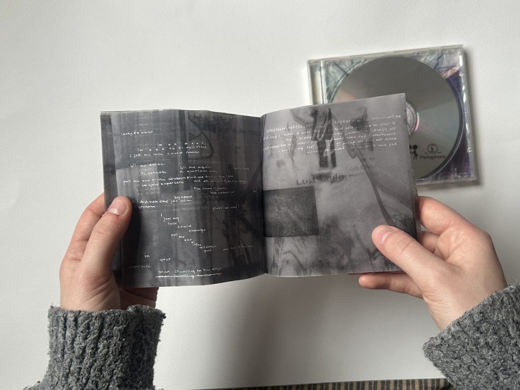
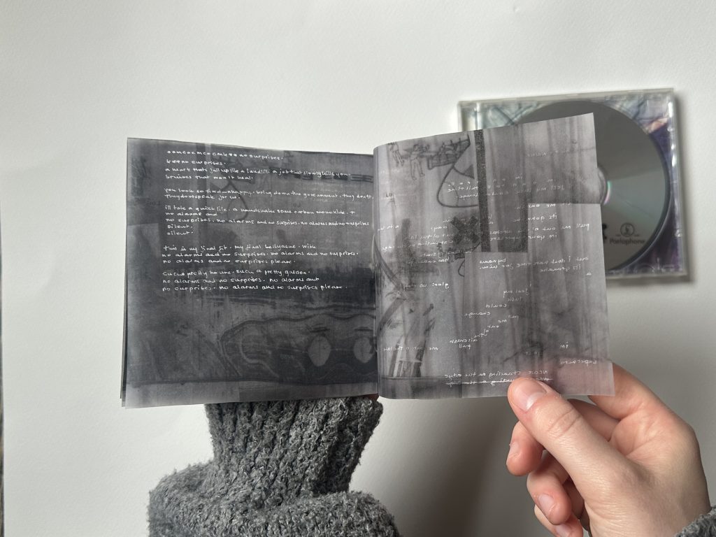
During the final crit, however, feedback suggested that presenting the booklet on its own felt incomplete. When revisiting the original OK Computer booklet, it was proposed that I incorporate some of its textual elements, such as the song lyrics, to better contextualise my version.
I therefore began experimenting with integrating fragments of the original lyrics alongside the layered imagery.
Similarly, during the final crit, my tutor suggested producing a process video to help viewers better understand the steps and iterations behind the final booklet. I decided to take on this feedback, staging the video using the existing prints and materials in order to demonstrate the process without generating unnecessary waste.
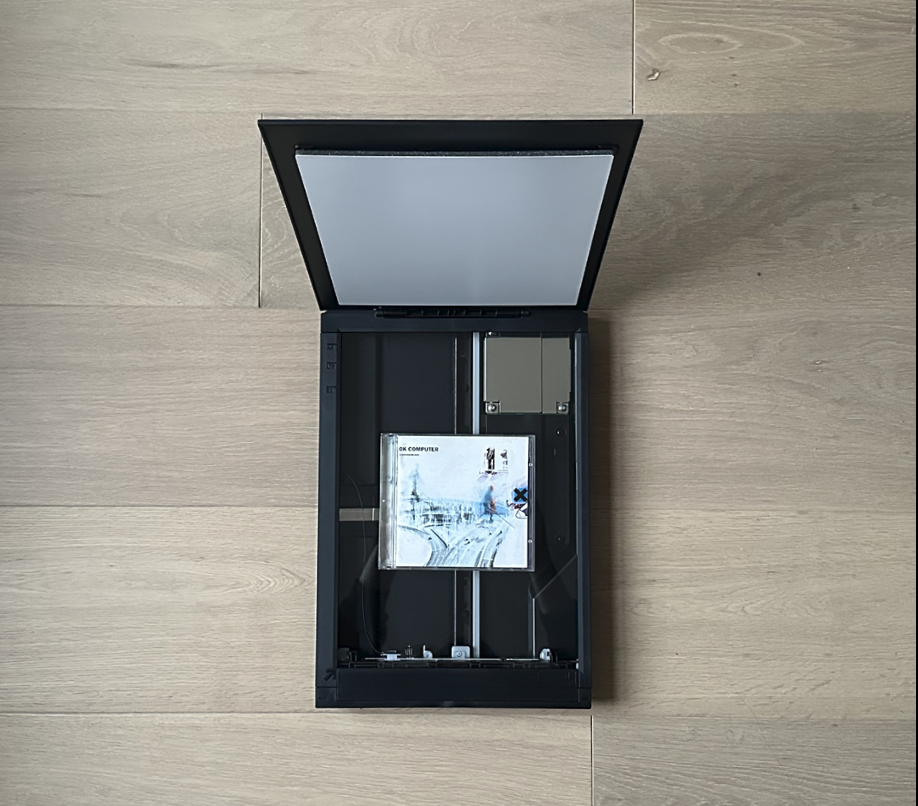
Following feedback from the crit, I removed Photoshop entirely and focused on working only with the scanner and printer. This shift towards analogue processes allowed the project to develop through physical manipulation rather than digital editing.
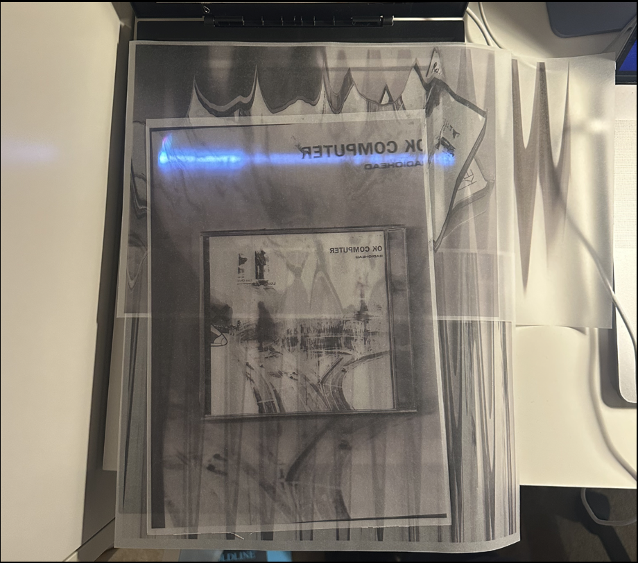
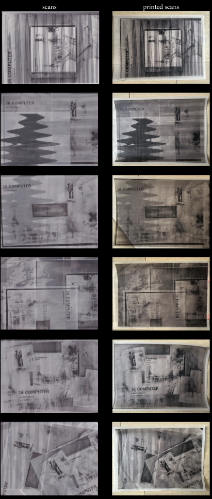
Instead of adjusting the image digitally, I began manipulating the CD cover directly on the scanner bed. By rotating the image, moving it during scanning, and experimenting with positioning, I could produce distortions that were generated entirely through the scanning process.
These distorted scans were then printed on a range of paper types, including coloured paper, lined paper, and tracing paper. I also experimented with both colour and black and white printing, and with different resolutions such as 72dpi and 300dpi to see how speed and compression would affect the image.
Over time, I found that the most visually successful results came from working in black and white on tracing paper at 72dpi. Removing colour strengthened the graphic qualities of the image and allowed the distortions created by the scanner to become more prominent.
Examples;
At this point I began thinking about the project in relation to Raymond Queneau’s Exercises in Style. In the book, the same simple story is retold multiple times under different stylistic constraints. The narrative itself does not change, but the method of telling it does.
Similarly, in my process the image remains constant while variation emerges through the system that produces it. Each scan introduces new distortions, compressions, or misalignments, gradually shifting the image further away from the original.
This made me reflect on authorship in a new way. If the machine is responsible for many of the transformations, where does authorship actually lie? Is it in the original image, in the designer’s decisions, or in the system that produces the variations?
I went to Radiohead’s exhibition in Oxford. This is where this project begins.
While visiting the exhibition, I read about the process used by the artists to produce the artwork for OK Computer. Stanley Donwood and Thom Yorke described a method based on repeatedly printing and scanning images, allowing the machine to gradually alter the image through distortion and degradation. The process was simple but systematic, and the final outcome was partly determined by the behaviour of the scanner and printer rather than by direct artistic control.
In their creation of OK Computer, Donwood and Yorke (1997) used a strict print–scan loop, allowing the machine to make certain decisions for them. Inspired by this approach, I decided to make my own copy of the artwork using a similar method. During this first week I recreated the image through repeated cycles of printing and scanning, using Photoshop to assist the process and adjust certain elements between iterations.
Very quickly, the image began to change in ways I did not fully anticipate. Colours intensified, particularly the blues, while some details disappeared and others merged together. Each new scan slightly altered the previous version, producing a gradual drift away from the original image.
What I found most interesting about this process was how it challenged my instinct as a designer to maintain control over the outcome. Normally, digital tools allow constant correction and refinement, but here the machine was introducing unpredictable changes that I had to accept and respond to.
This made me begin asking a series of questions about authorship and control in design.
How much control do we actually need in order to feel confident in our work? What happens when tools resist us instead of obeying us?
While copying OK Computer through a print–scan process, I became increasingly aware of how little control I had over the image. Each time I printed and rescanned, the image shifted in ways I could not fully predict. Colours intensified (especially the blues), details disappeared, and layers merged unexpectedly. Rather than feeling frustrating, this loss of control became the most engaging part of the process.
Working without undo forced me to accept each decision as permanent. Instead of correcting mistakes, I had to respond to them. This changed my relationship to making: the process felt less about perfecting an outcome and more about staying present and adapting to what the image became. The copy slowly moved away from precision and towards something more instinctive and personal. This raised questions about control and authorship in design. How much control do we need in order to feel confident in our work? What happens when tools resist us instead of obeying us? Can letting go of precision create a different kind of honesty within graphic practice? How does that translate in creating commercial work for brands?
To explore this further, I propose a studio experiment focused on controlled loss of control. Using the same base image, I want to repeat a print–scan cycle while limiting my ability to intervene, observing how the image evolves when decision-making is reduced and the process itself begins to lead.
Draft 2;
In Exercises in Style, Queneau (1998) offers a useful framework through which to reconsider my project. In the book, the author retells the same short, banal event ninety-nine times, each version constrained by a different stylistic rule. What changes is not the content, but the method of telling. Meaning emerges not from invention, but from repetition, variation, and constraint. This approach closely mirrors the direction my practice has taken. While my initial copy of OK Computer explored degradation through a print–scan loop, my process has since become more raw and materially driven. I removed digital design tools such as Photoshop entirely, working only with a printer, scanner, paper, and scissors. The act of making became physical: cutting, layering, reprinting, rescanning. Each iteration was not a refinement toward a better image, but a re-statement of the same source through altered conditions.
Like Queneau, I am working with a fixed starting point. The image does not change, but the system around it does. Each scan introduces distortion, compression, shift, or accidental alignment. The constraints are not pre-written rules, but mechanical and material ones; paper quality and style, density, colour, scanner glare. Over time, these limitations begin to function like Queneau’s stylistic exercises, shaping outcomes while resisting total authorial control.This comparison reframes my earlier questions about control and authorship. In Exercises in Style, Queneau remains present as the orchestrator, yet the individuality of each version is produced by the constraint itself. Similarly, in my process, authorship feels distributed between myself and the machine. The printer and scanner are not neutral tools executing instructions, but active participants that introduce their own logic and errors. What becomes increasingly clear is that variation itself is the content. The project is no longer about copying OK Computer faithfully, nor about producing a singular final image. Instead, it operates through accumulation. Meaning appears across multiple outcomes rather than within one resolved piece. This aligns with a mode of iteration where the process, rather than the result, becomes the primary output.
Viewing my work through Queneau’s methodology clarifies the direction of my studio experiment. Rather than aiming for aesthetic improvement, the focus shifts toward systematic difference: repeating the same act while allowing form to mutate. The act of scanning becomes a form of writing, where each pass produces a new sentence composed by friction, error, and constraint. This perspective strengthens my inquiry into graphic communication by questioning where expression truly sits. Is it located in the image itself, in the system that produces it, or in the accumulation of versions over time? By embracing analogue iteration and limited control, the work moves away from design as optimisation and toward design as exploration, where meaning is not designed in advance, but discovered through repetition and interpretation.
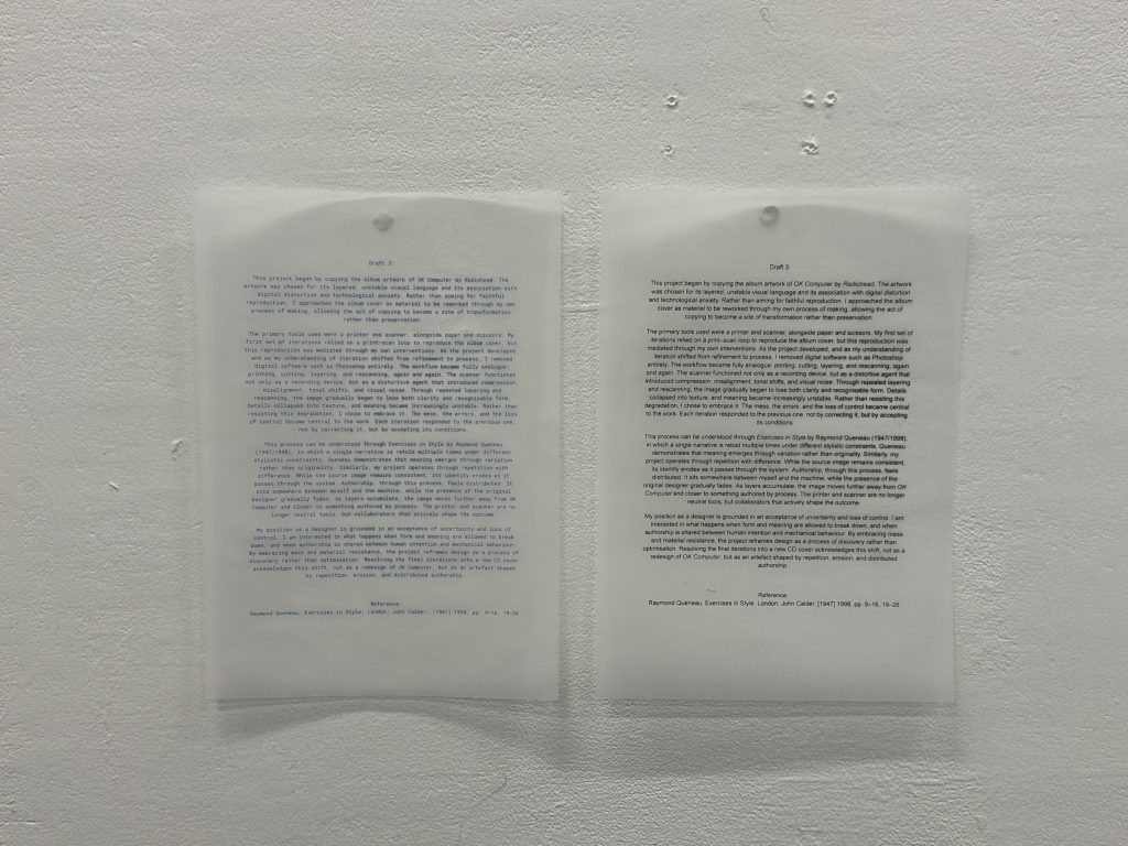
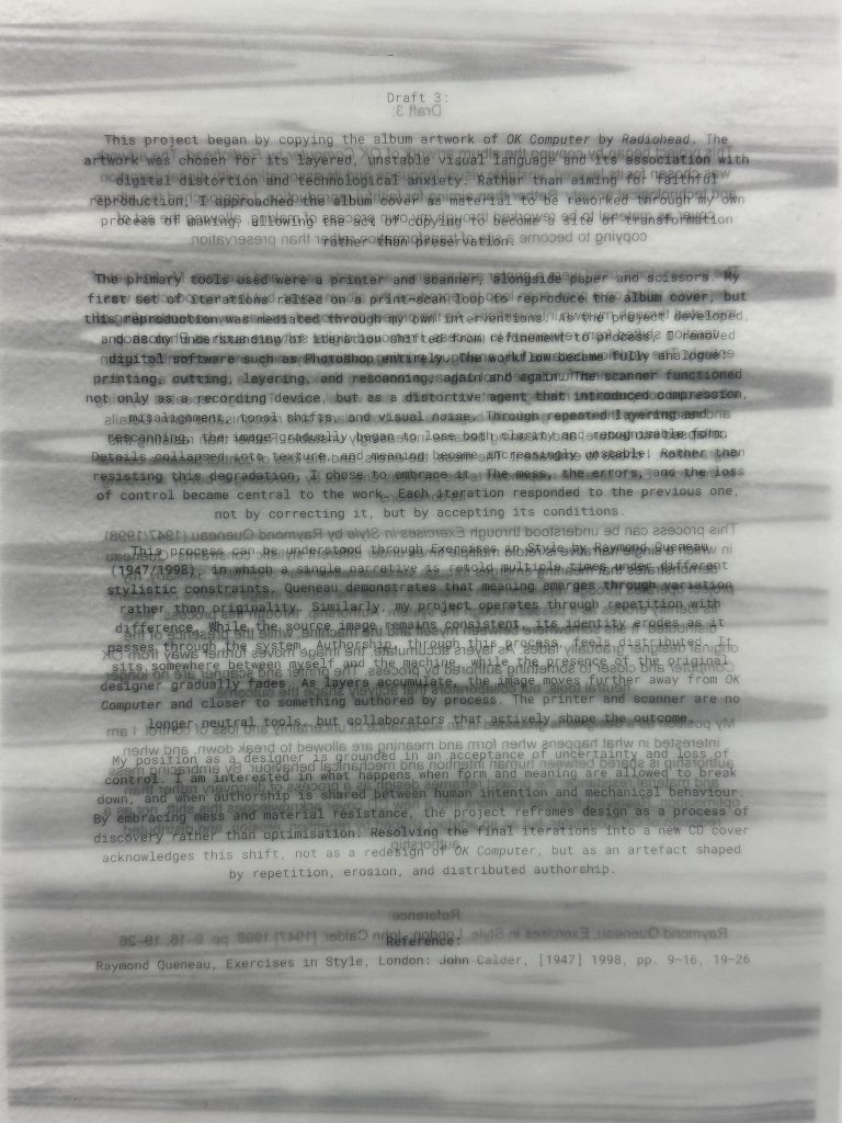
Draft 3;
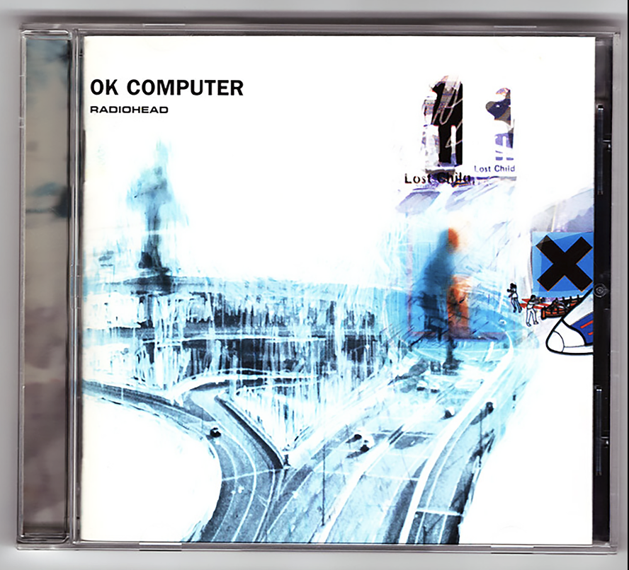
This project began by copying the album artwork for OK Computer by Radiohead (Donwood & York, 1997). The artwork was chosen for its layered, unstable visual language and its association with digital distortion and technological anxiety. Rather than aiming for faithful reproduction, I approached the album cover as material to be reworked through my own process of making, allowing the act of copying to become a site of transformation rather than preservation.
The primary tools used were a printer and scanner, alongside paper and scissors. My first set of iterations relied on a print–scan loop to reproduce the album cover, but this reproduction was mediated through my own interventions. As the project developed, and as my understanding of iteration shifted from refinement to process, I removed digital software such as Photoshop entirely. The workflow became fully analogue: printing, cutting, layering, and rescanning, again and again. The scanner functioned not only as a recording device, but as a distortive agent that introduced compression, misalignment, tonal shifts, and visual noise. Through repeated layering and rescanning, the image gradually began to lose both clarity and recognisable form. Details collapsed into texture, and meaning became increasingly unstable. Rather than resisting this degradation, I chose to embrace it. The mess, the errors, and the loss of control became central to the work. Each iteration responded to the previous one, not by correcting it, but by accepting its conditions.
This process can be understood through Exercises in Style by Queneau (1998), in which a single narrative is retold multiple times under different stylistic constraints. The author demonstrates that meaning emerges through variation rather than originality. Similarly, my project operates through repetition with difference. While the source image remains consistent, its identity erodes as it passes through the system. Authorship, through this process, feels distributed. It sits somewhere between myself and the machine, while the presence of the original designer gradually fades. As layers accumulate, the image moves further away from OK Computer and closer to something authored by process. The printer and scanner are no longer neutral tools, but collaborators that actively shape the outcome. My position as a designer is grounded in an acceptance of uncertainty and loss of control. I am interested in what happens when form and meaning are allowed to break down, and when authorship is shared between human intention and mechanical behaviour. By embracing mess and material resistance, the project reframes design as a process of discovery rather than optimisation. Resolving the final iterations into a new CD cover acknowledges this shift, not as a redesign of OK Computer, but as an artefact shaped by repetition, erosion, and distributed authorship.
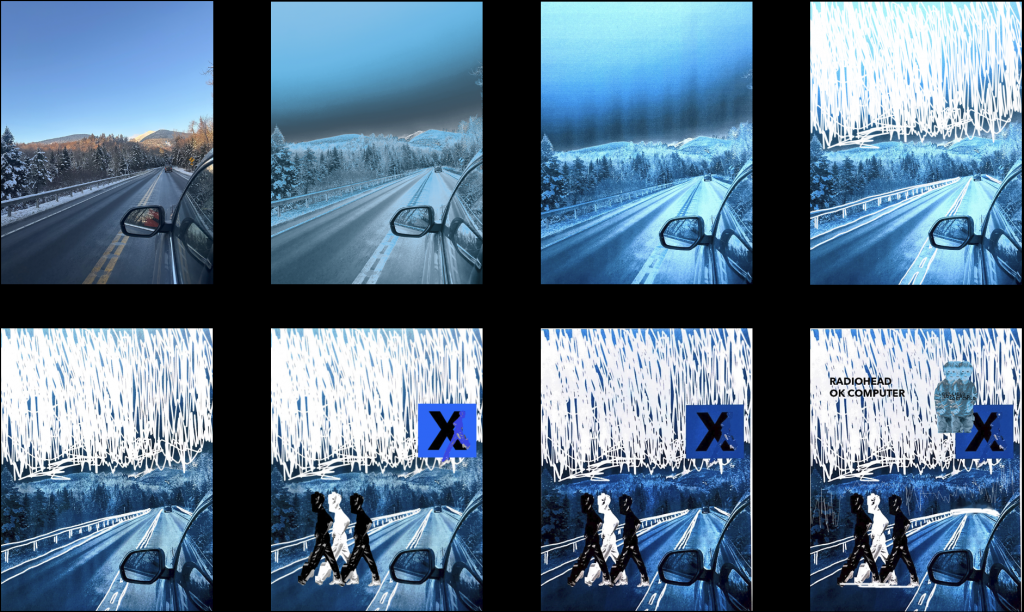
Blending my enquiry for draft 3;
Initial print on tracing paper, blue evoking the cover of OK Computer.
Moving on, layering my print with previous prints, using the same print scan process.
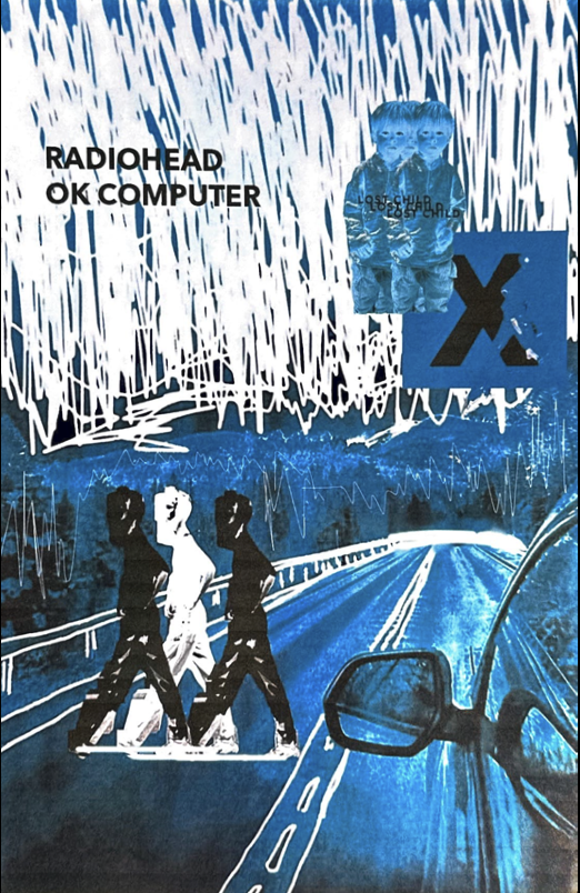
Final print;
References;
Donwood, S. & Yorke, T., 1997. Album artwork for OK Computer. Radiohead.
Queneau, R., 1998. Exercises in Style. London: John Calder. (Originally published 1947)
Prompt: Select one reading from the course reading list and ‘re-present’ its main arguments and ideas using the structure, form, or method of another reading on the list.
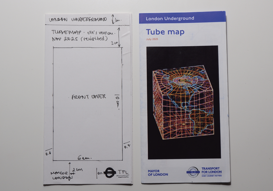
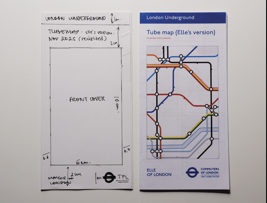
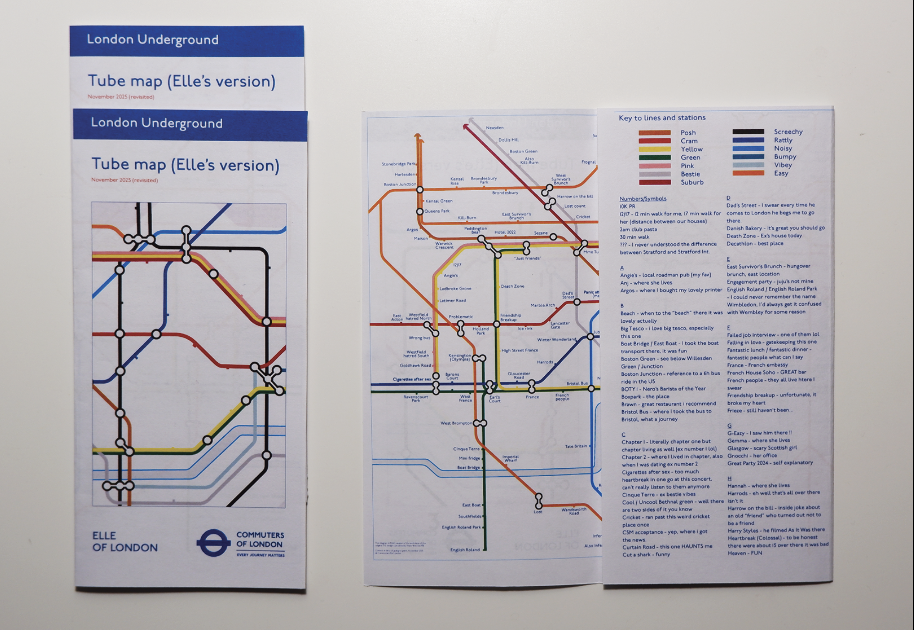
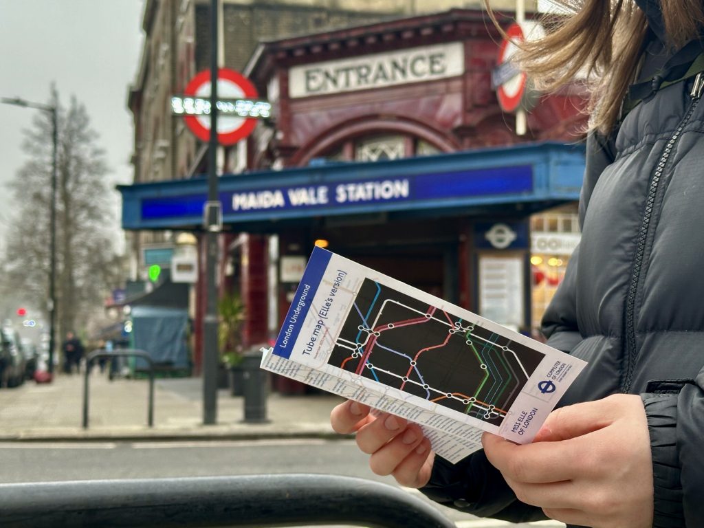
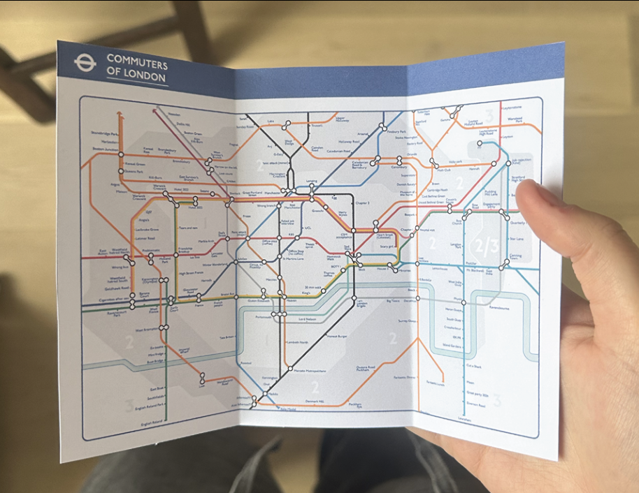
For the second week of the project, I decided to work with the modern TfL pocket map as the medium for my translation. The pocket map felt like the most appropriate format, as it is something people physically interact with while navigating the city. By adopting its structure and dimensions, I could keep a direct relationship with the original object while introducing my own interpretation.
I began by creating a prototype matching the exact dimensions of the official pocket map, using it as a template for my translated version. This allowed me to think not only about the map itself, but also about how it is handled, unfolded, and read. The goal was to keep the familiar physical format while gradually introducing my own system of associations.
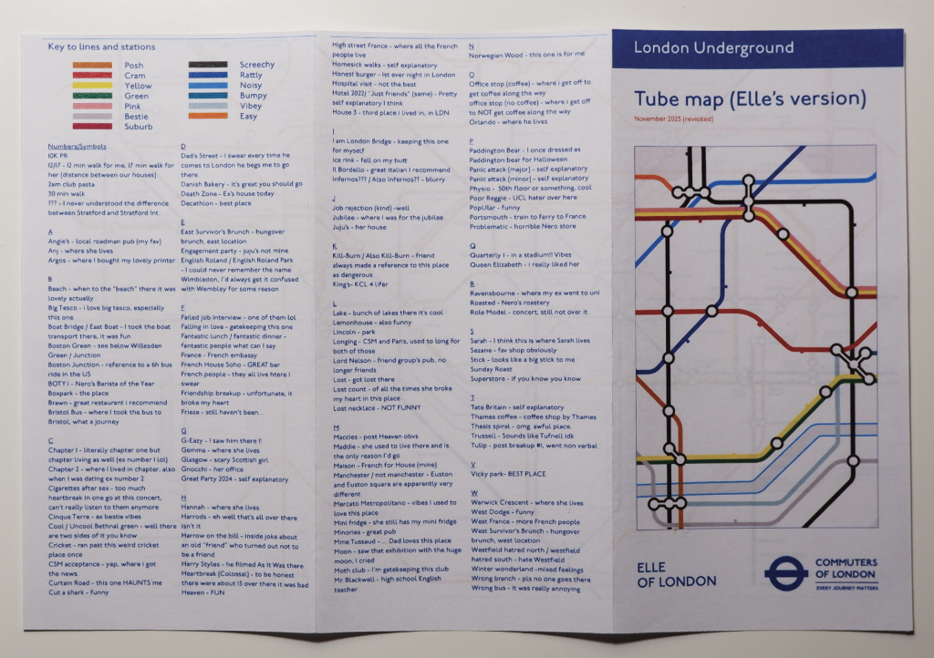
During the final crit, viewers raised an interesting point. While the personalised stations and routes suggested individual experiences of London, it was not always clear what each reference meant. Some viewers were curious about the stories or associations behind the names. Following this feedback, I considered including an index within the publication. The index would allow readers to look up the stations and uncover the meanings behind them, creating a small narrative layer that could encourage people to engage more closely with the map, turn its pages, and potentially start conversations about their own experiences of the city.
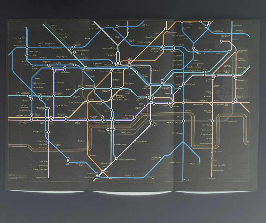
Alongside this, I began experimenting with the visual language of the map itself. One idea that emerged during development was to print the map as a negative, inverting the colours of the original design. Visually, this produced a striking and graphic result, emphasising the diagrammatic qualities of the map. However, it also introduced an unexpected effect. Rather than reinforcing the idea of connection between personal experience and the city’s infrastructure, the inverted map created a subtle sense of distance from the familiar geography of London. The visual language felt more detached from the everyday experience of using the map.
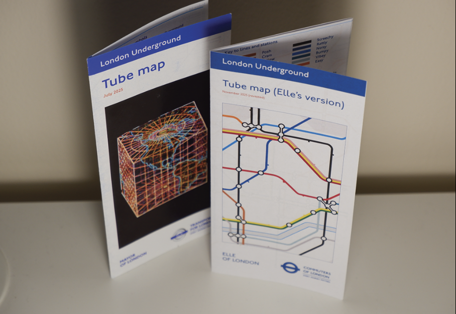
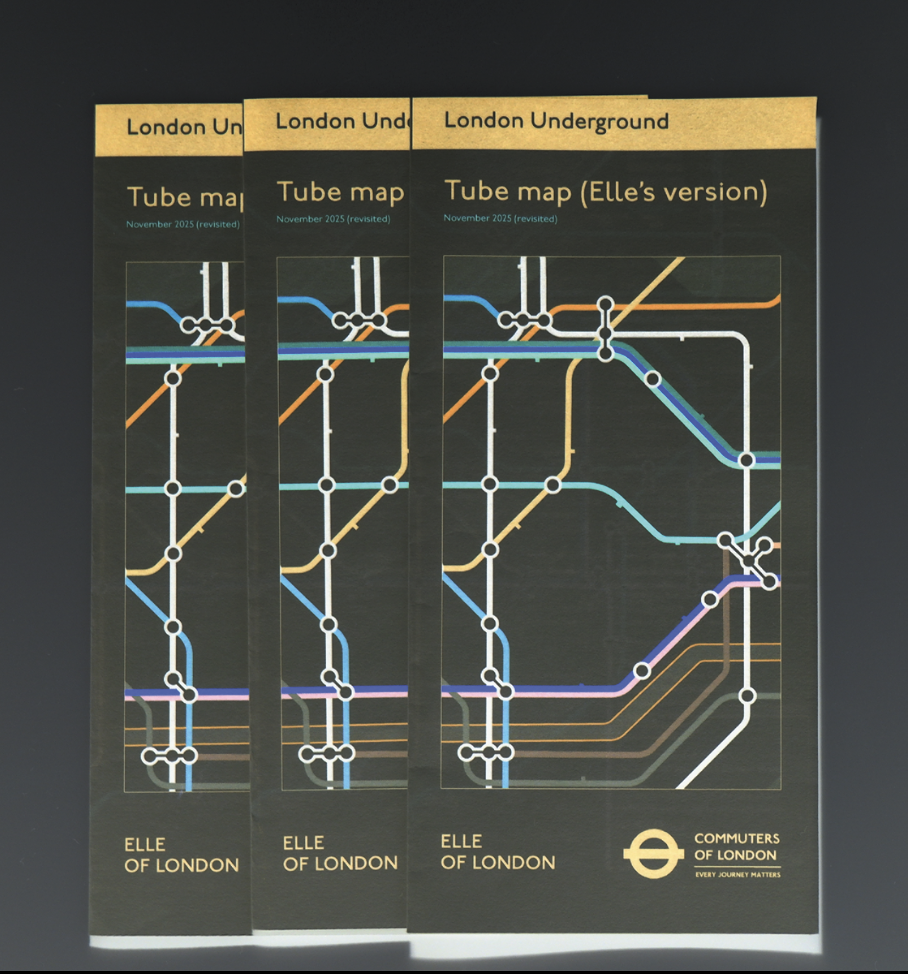
To resolve this, I adopted a hybrid approach. The front cover of the publication “hijacks” the original TfL map by presenting it with inverted colours, allowing my intervention to stand out while still referencing the recognisable visual identity of the system. Once the reader opens the map, however, the design moves closer to the original visual language. This balance allowed the project to introduce a personal reinterpretation while still maintaining a sense of familiarity with the existing transport map.
Final Print;
To reinforce the connection to the original map, I also considered the material qualities of the publication. The final iteration was professionally printed on paper with a similar weight and laminated finish, reflecting the materials typically used in transport maps and other commercial print formats.
Further developments;
Developing further, whilst I did not have time to explore the blank map in more detail, it could be interesting to turn it into an installation. The map could be presented as a large blank surface where visitors are invited to draw their own routes, places, and memories, gradually building a collective map shaped by many individual experiences. Over time, the map would evolve into a layered portrait of how different people understand and move through the same city, revealing overlaps, shared routes, and unexpected connections.
The idea could also evolve into a connection-based card game. Each card could represent a station or location, and players would build their own networks by linking cards together. Instead of following the fixed logic of the official TfL map, the game would encourage players to map personal relationships between places, including emotional memories, routines, or encounters. In this way, the map shifts from a tool of navigation to a playful system for sharing experiences and fostering connection between players.
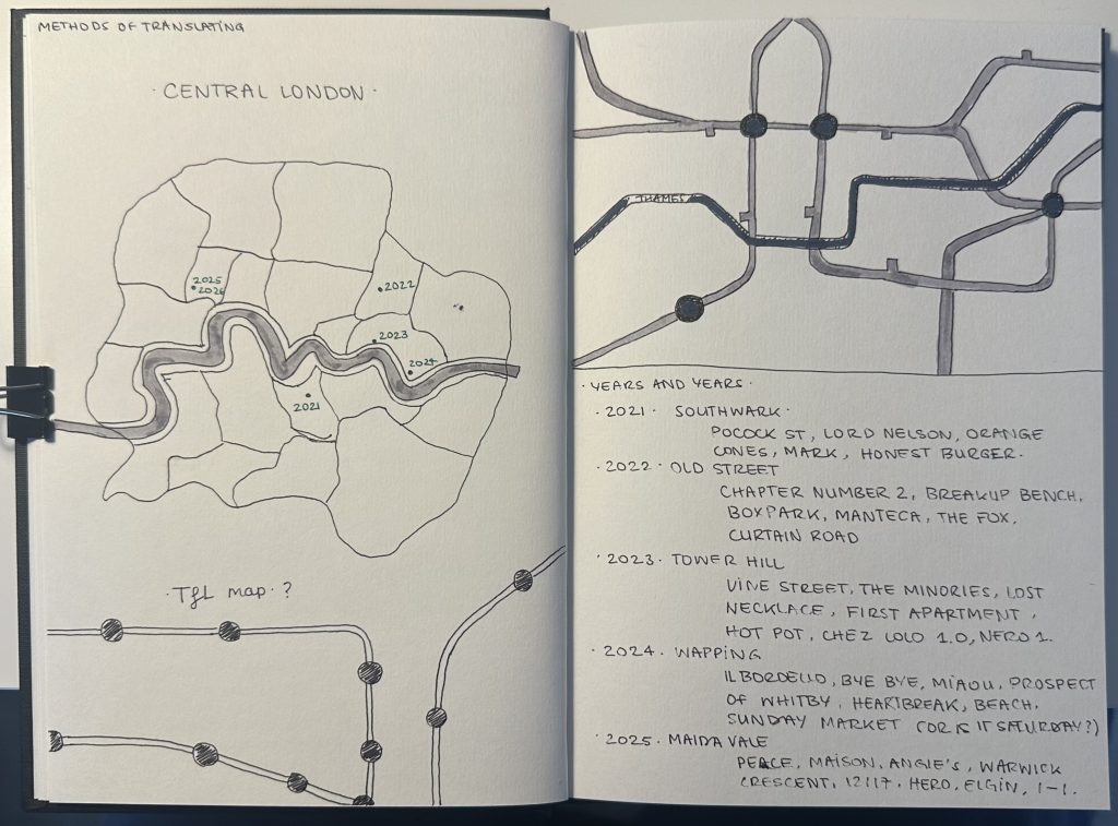
This project began with the idea of translating a city through personal experience rather than geography. When thinking about London as a whole, I realised that my relationship to the city is not built from an objective understanding of its layout, but from a series of personal landmarks: pubs, streets, tube stations, and small routines that only make sense to me. In that sense, the London I navigate is already a kind of translation.
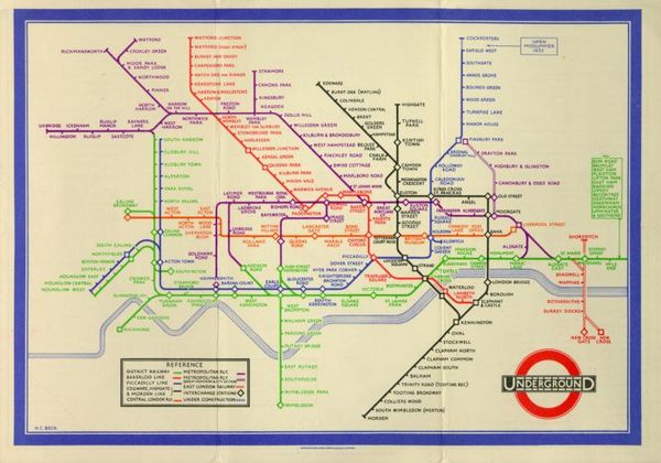
This led me to think about maps. At first, I considered working with a map of London itself. However, the more I reflected on it, the more I realised that the Transport for London map already performs a form of translation. Designed by Harry Beck in 1933, the map does not attempt to represent the geography of London accurately. Instead, it simplifies the network into a diagram inspired by electrical circuits, prioritising clarity and legibility over spatial accuracy. Beck famously argued that a map does not need to be geographically correct as long as it makes sense to the user.
This idea resonated strongly with my thinking. If the TfL map is already a translated version of the city, could it be translated again to reflect individual experience?
I began thinking about how different people navigate London through their own mental maps. Places become renamed, routes become habitual, and certain stations carry personal meanings that are invisible to others. After speaking with friends and people close to me, I realised that each of us carries a slightly different version of the same city.
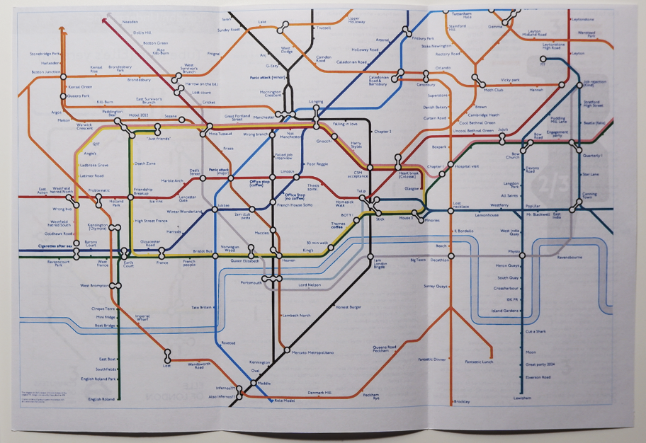
From there, the TfL map became my starting point. Rather than treating it as a fixed diagram, I approached it as a structure that could be hijacked and reinterpreted. The goal was to translate the map into a reflection of personal experience: highlighting specific stations, routes, and connections that shape how someone understands the city.
The first experiments involved altering the visual language of the map while keeping its recognisable structure. I explored different ways of emphasising personal routes, renaming locations, and shifting the hierarchy of information so that subjective experience could sit alongside the official network.
This process raised a broader question: if the TfL map simplifies London in order to communicate effectively, what happens when that system is used to communicate something more personal?
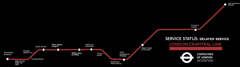
I first began by remapping the “Cramtral” line, before expanding the process to the entire map. I created a filled-out version that reflected my own associations and experiences, alongside a blank version intended to invite others to contribute their own. At this stage, the map existed simply as a single-sided printed format.
PROMPT: Select any text—or an excerpt of any text—from the course reading list and apply one of the following methods of cataloguing in order to analyse its purpose, value, or meaning: 1. Inventory or 2. Metadata
Metadata- The Medium is the Message
This catalogue entry uses McLuhan’s “The Medium Is The Message” to demonstrate, in practice, that form is not secondary to content but actively structures meaning (McLuhan, 1964).
The text is treated as an archival object and described through controlled fields (scope and content, subject formation, power / control note, etc.) on an object card, rather than through conventional argumentative prose. By doing so, the record shows how different media produce specific kinds of subjects, reorganise perception and attention, and redistribute control, which is precisely what McLuhan identifies as the “message” of a medium.
The point is that the catalogue itself performs the argument; the way the object is catalogued becomes evidence of how medium determines interpretation. In that sense, the method (metadata) and the content (McLuhan’s claim) are aligned.
From last week’s discussions, four questions carried into this week and shaped the direction of my work:
What are the repercussions of language on narrative authority? (yes this question again, but it’s a bit one)
How many of these murders are femicides?
Can organising them by crime type reveal underlying patterns?
What role does language play in shaping perceptions of women, legally and socially?
Method; selecting and classifying
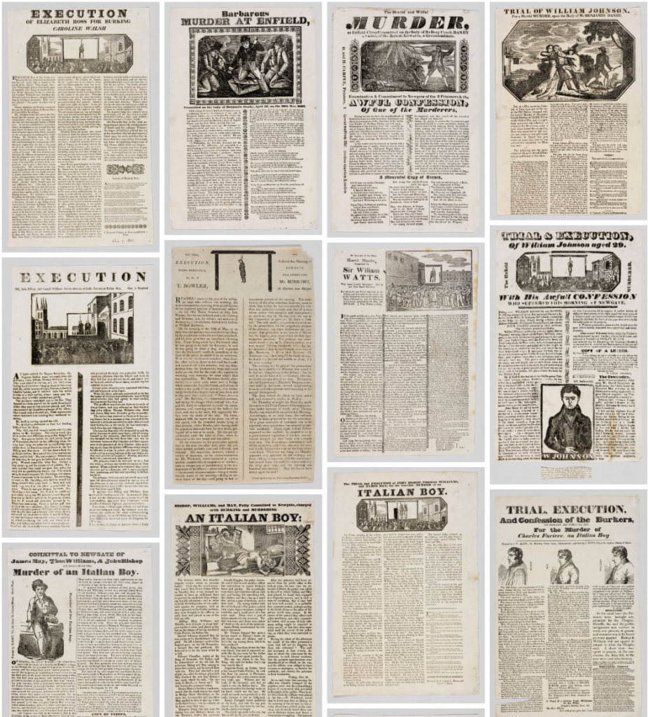
I began by selecting ten broadsides at random from the same collection I had previously explored. To avoid repetition, I removed any duplicates that told the same story. The remaining examples were grouped into three working categories:
Femicides
Infanticides / pedicides
Man-on-man murder (apparently Menicide is not a thing)
Out of the ten, eight depicted femicides, one involved pedicide, and one was a man-on-man murder. In all cases, the perpetrators were men, and the majority of victims were women. The imbalance was immediate and difficult to ignore.
This classification stage was important because it grounded my project in observation through process-led “research” rather than assumption.
Contextualisation:
What are the crime rate statistics of late 18th century / early 19th century England ?
The percentage of recorded crime was ciritcally low compared to its actual occurence.
This is partly due the periods of Industrial and Agricultural revolutions (lack of police).
The period between 1810 and 1820 saw the most dramatic rise in crime. This was a time of rising food prices, poverty and unemployment after the end of a series of wars with France.
Most convictions were committed by men.
What are the legislations regarding crime ?
Homicide was not a common crime in the late 18th century but it grew in popularity as the new century began. Broadsides had that effect, people attended public executions.
English homicide law was governed by the “Bloody Code,” which enforced capital punishment for a vast number of crimes.
The convictions at the Old Bailey were overwhelmingly male, and still are today.
What are modern statistics with regards to homicide ?
Males accounted for approximately 93% of convicted murder suspects in the year ending March 2022 (England and Wales only).
With regards to general crime, over 80%, is committed by men.
Most proceedings took place at the Old Bailey, where is that?
Central Criminal Court ! EC4M 7EH
Access to the online database of historic proceedings.
Re-framing Through Colour and Narrative
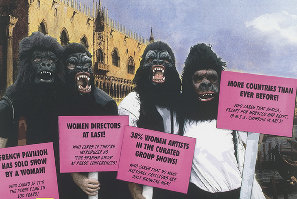
This made me think of the Guerrilla Girls.
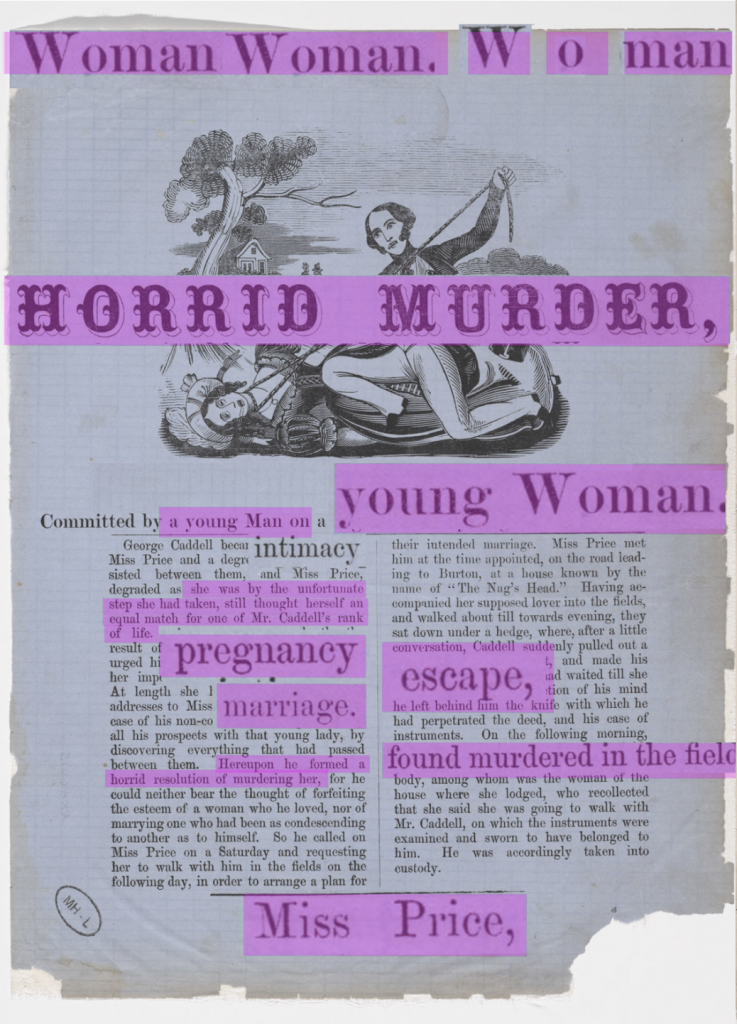
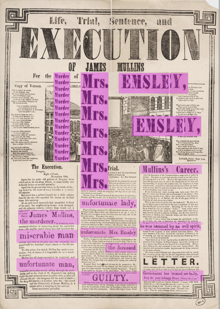
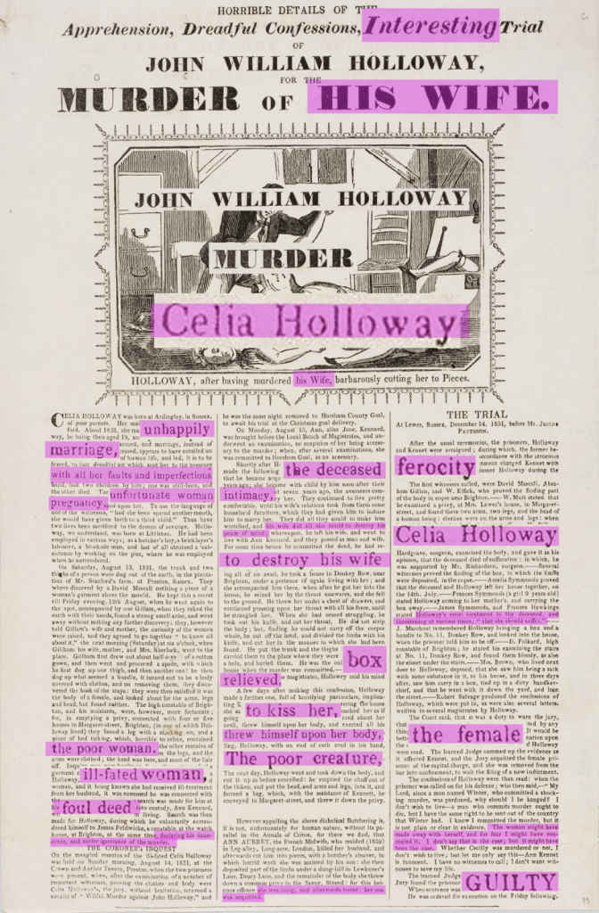
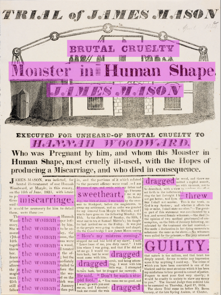
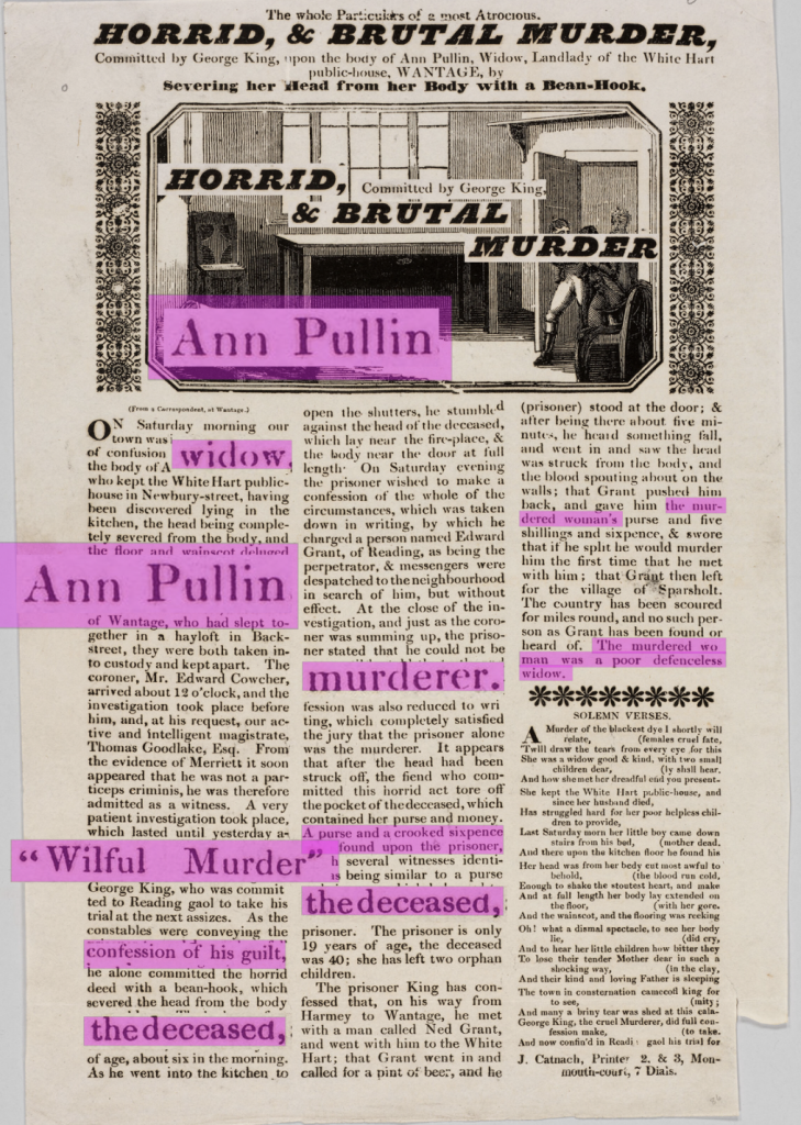
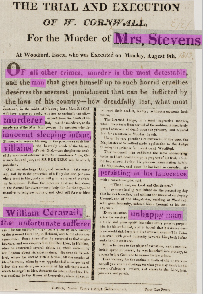
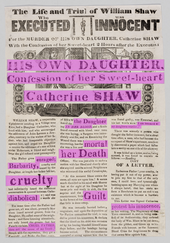
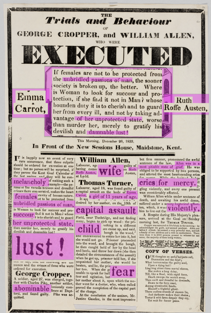
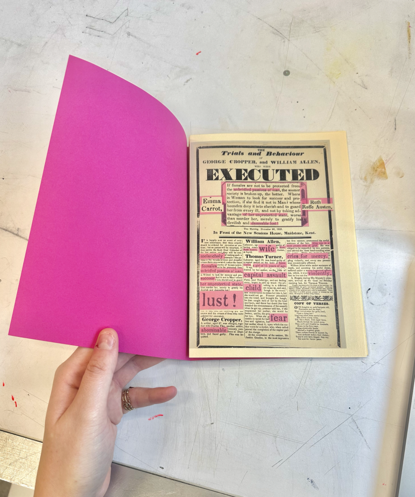
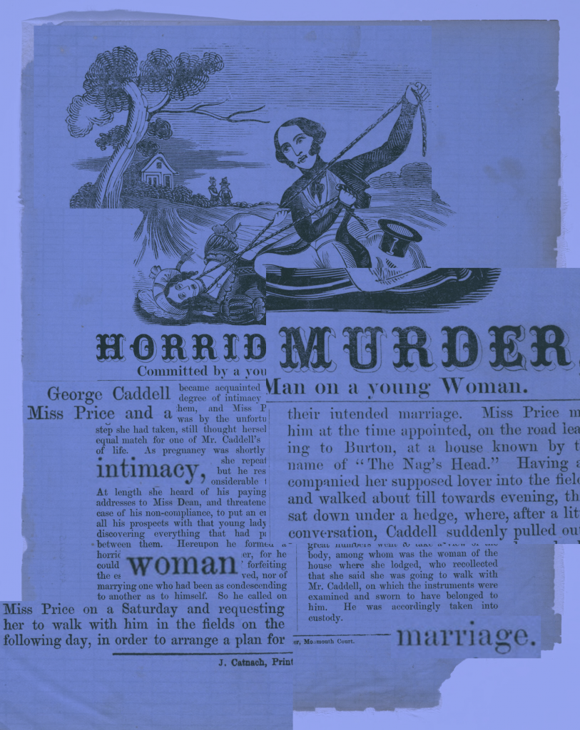
I therefore applied bold pink overlays to selected words and phrases, deliberately interrupting the original hierarchy. Rather than blending in, the colour competes with the historical typography, starting a patriarchal exploration of the collection.
In some cases, I isolated and repeated terms such as “Woman” and “Mrs.”, enlarging their presence so they rival the dominant headlines. In others, I replaced relational descriptions like “HIS WIFE” with the proper name Celia Holloway, shifting visibility back to the victim. I also highlighted words such as “miscarriage” and “dragged” to draw attention to how violence is narrated and distributed linguistically.
These interventions were selective rather than wholesale rewrites. Through emphasis, repetition, and strategic substitution, I redistributed narrative weight. The original broadsides centre male authority and spectacle; my edits redirect attention toward the women and the language used to frame them.
Below are a few examples…
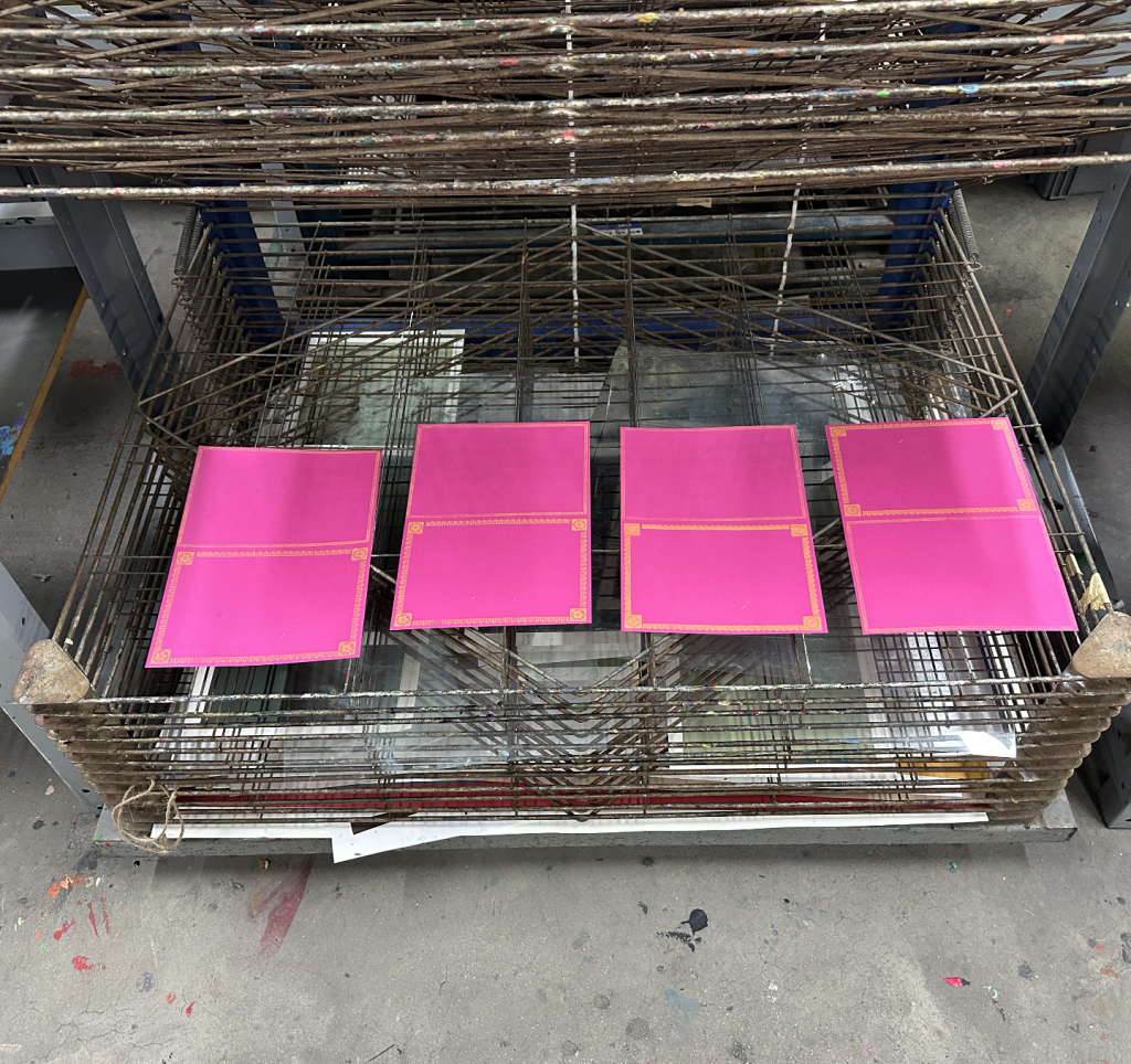
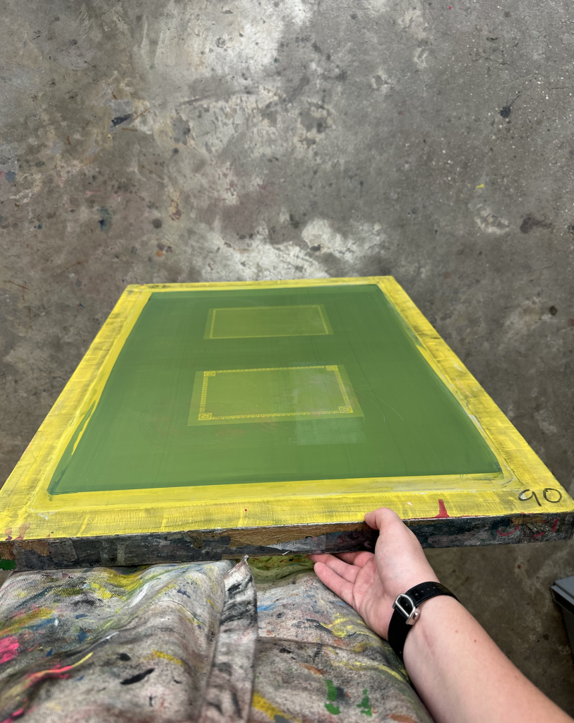
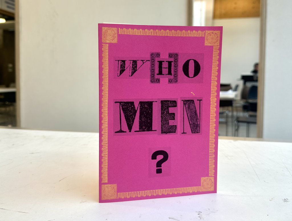
These broadsides now re-told the story differently, changing the narrative where women were often referred to as “someone’s wife” to a person with a name and agency. Pursuing this idea of dual existence between past and present, I thought it would be interesting to denounce the perpetuation of femicides in a publication which itself listed as a dialogue between past and present. I therefore decided to explore screen-printing techniques for the cover of the publication.
Putting it all together, I decided to create a small “flyer holder” publication, with detachable pages to extend this dialogue into public space by raising awareness around the persistence of femicide today.
Here’s what it looked like for the end of the week.
I intended to use letterpress in order to keep the aesthetic of the cover consistent, but due to time constraints, I ended up having to take letters from the initial broadsides in order to make the title “W(H)O MEN” and print them. In retrospect, this adaptation strengthened the concept of past and present, adding to the value of this little publication.
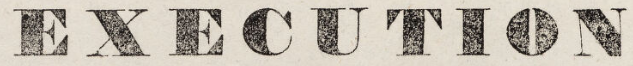
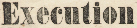
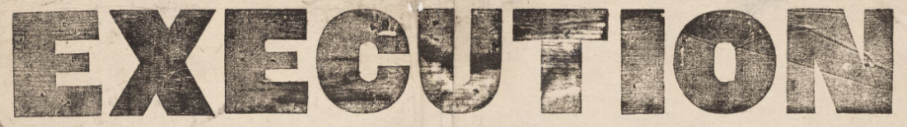
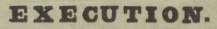
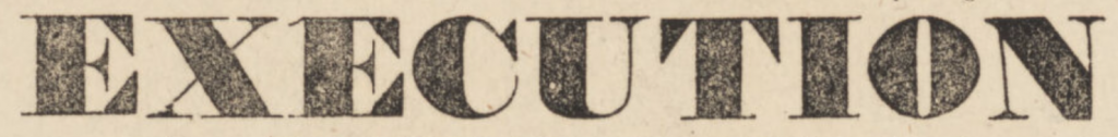
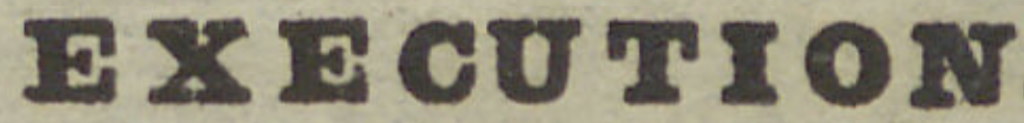
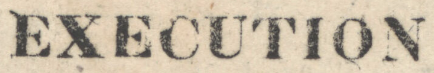
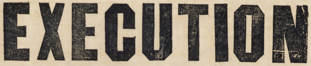
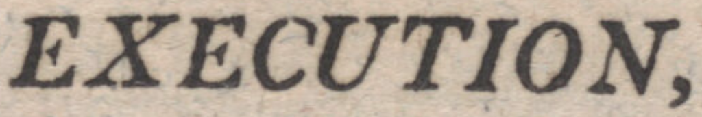
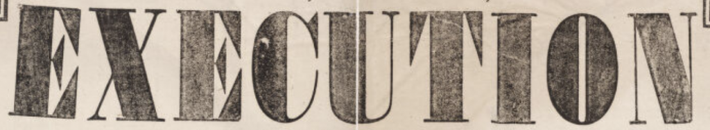
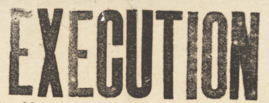
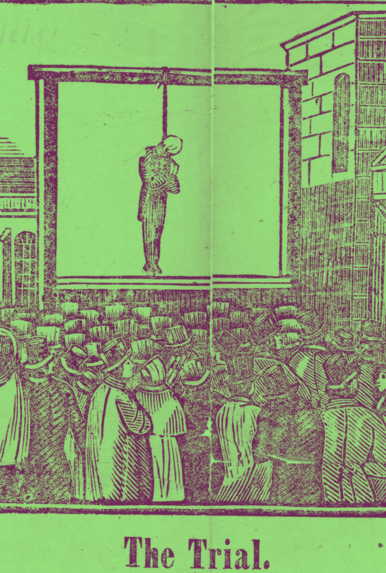
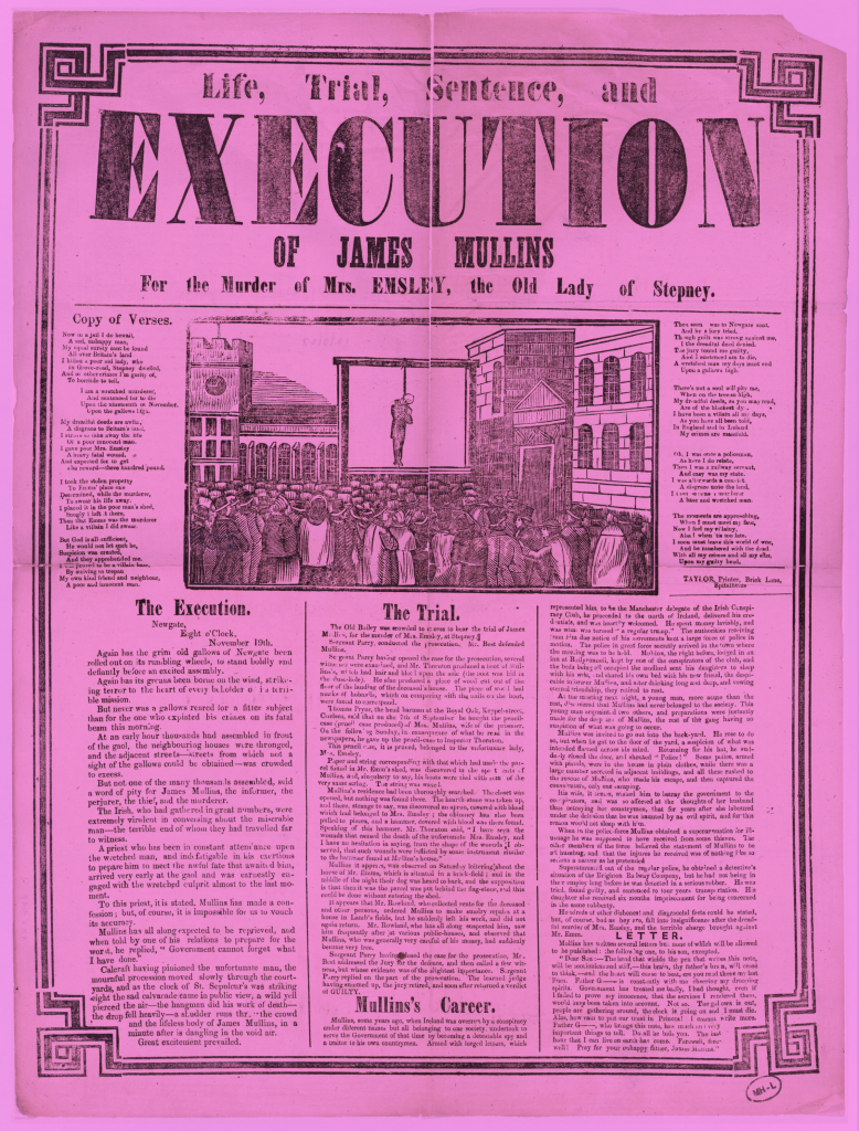
This week began with looking through the broadsides and considering different ways they could be catalogued beyond conventional archival systems. I was immediately drawn to the repeated use of the word “execution.” It appears consistently, but never in exactly the same way. That repetition felt significant both visually and conceptually.
I therefore decided to focus only on the word “execution” as a filtering device. My first step was to scan through a broad selection of broadsides and isolate every instance of the word. Rather than collecting entire posters, I cropped or noted only the typographic look of that single word. This reduction allowed me to treat it almost as a specimen rather than as part of a narrative. I then decided to look into the etymology of the word.
The word execution comes from French, my native language, meaning “passer à l’accomplissement de quelque chose”, which literally translates to “to proceed to accomplish something”. To do. To make. To execute, some-thing.
See at the link below, nine different definitions of the word execution:
Execution has many different meanings in itself, yet this collection of “executions” serves as a typographic exploration and cataloguing of England’s 18th Century printmaking techniques.
Going back to my cataloguing…
At first, my selection was intuitive; I picked examples that felt visually distinct. However, as I continued, I realised I needed clearer criteria. I began to categorise them based on:
Scale (how dominant the word was in the composition) Placement (centred, embedded within text, used as a heading)
Emphasis (boldness, spacing, ornamentation)
By narrowing my focus to one word, I unintentionally created a micro-archive within the archive. The act of repetition shifted from being about content to being about visual rhythm. Through this process, I started noticing patterns; some versions emphasised authority and severity through heavy type, while others blended into dense blocks of text. This experiment became less about the meaning of the word and more about how repetition produces variation. This process taught me that cataloguing can isolate a single element and can generate almost independent meaning through context, however, I decided to go forward with a different idea, as this one felt rather limited in creative potential.
2. Alt-text and braille
For the second experiment, I shifted my attention from visual dominance to accessibility. Instead of cataloguing through sight alone, I asked: How might these broadsides be experienced without vision? On their respective information pages, each broadside includes a set of notes, including a vivid alt-text–like description of the engraving, each carefully written. Alt-text exists to make digital content accessible to people using screen readers.
I began by reading the existing alt-text descriptions of selected posters. They were surprisingly detailed, almost literary in tone. I then attempted to write my own versions. Very quickly, I realised my first attempts were overly descriptive; I tried to include everything. But what is everything? This made me understand that description itself requires editing and hierarchy. I had to decide:
What is atmospheric (tone, emotional weight)?
What information is essential?
What is structural (layout, typography)?
What is narrative (the story of the crime)?
Through rewriting and comparing my descriptions with the originals, I began to see alt-text as an interpretative act in its own right. It is not neutral. It prioritises certain details, creates emphasis, and inevitably leaves things out. In trying to make the image accessible, I was also reshaping it.
From there, I considered braille as a physical extension of this method. I researched basic braille translation conventions and began imagining how these dense visual posters might translate into tactile text. That shift exposed how much of the broadsides’ authority and drama come from scale, ornamentation, and typographic hierarchy; qualities that largely disappear in braille.
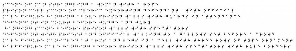
My aim became to enhance the accessibility of the collection by developing a catalogue built entirely from detailed alt-text descriptions, which could then be translated into braille. I began compiling selected engraving descriptions, such as:
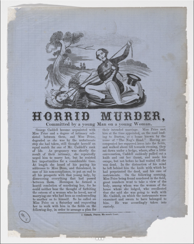
Wood engraving (13 x 10 cm.) : Scene of man strangling a woman with a rope.
Wood engraving (8.5 x 10.5 cm.) : Prison cell scene of cleric exhorting defendant, with official.
Wood engraving (8.5 x 17.5 cm.) : Male figure, hanging above prison walls, with guards in attendance.
Wood engraving (14 x 23 cm.) : Defendant in court before judge and jury.
Wood engraving (13.5 x 17 cm.) : Hanging scene before prison walls, with spectators.
Wood engraving (9 x 19 cm.) : Defendant, with priest and official, walking to a gallows set before a crowd.
Wood engraving (8.3 x 7 cm.) : Male figure, manicled at arms and legs, in a cell. With three rows of type ornament.
Wood engraving (6 x 16 cm.) : Half-figure male, hanging before prison walls with spectators. With rule borders.
Which in braille would be simply translated as;
In this sense, these Braille descriptions would be reduced to tactile text without scale, ornament, or visual hierarchy. That reduction interested me as it stripped the broadsides back to narrative and action.
I wanted to take this further by producing a physical collection of broadside alt-texts, printed on plastic sheets to allow for braille embossing and durability. The idea was to create a parallel archive: one that could be handled and read differently.
This process raised a broader question for me: are cataloguing systems fundamentally built around sight?
By reframing the broadsides through accessibility, I was not just describing them; I was questioning what is preserved and what is not when format changes. The experiment then shifted from description to critique. It became less about transcription and more about exposing the assumptions embedded in conventional archival systems.
During the crit, this proposal was met with some (understandable) criticism. Because of the violent nature of the broadsides, the translation into braille was seen by some as potentially unsettling or inappropriate. I did not fully share that view, but I decided to pause the idea for now.
Still, the possibility of working with braille as a material and conceptual medium has stayed with me. I think it holds real potential for a future project.
3. Hijacking
The third experiment moved into reinterpretation. I began to “hijack” elements of the broadsides by deliberately altering them to see how meaning would shift.
At first, my approach was intuitive. I removed or repositioned certain textual components and simply observed what changed. However, I quickly realised that if I wanted this to function as a method rather than just visual play, I needed clearer intervention rules.
I began applying structured alterations such as:
Removing all body text and keeping only the headline
Changing the colour of the broadside
Rearranging typographic hierarchy
Cropping out names while keeping the crime descriptions
Instead of changing everything at once, I altered one element at a time. This made it easier to see cause and effect.
Each alteration produced a very different reading. When the name was removed, the crime became abstract and almost anonymous. When the decorative border remained without text, the poster shifted from being informational to ornamental. When hierarchy was reversed, minor details suddenly felt central.
(Few examples:)
Through this process, I realised that meaning in these broadsides is interestingly not fixed, it is constructed through composition. Authority comes from structure: scale, placement, naming, sequencing. Once those systems are disrupted, the narrative is too. What started as playful experimentation gradually became a way of testing structural dependence.
As I looked closer, I also became aware of how strongly the language reflects patriarchal systems (which I suppose makes sense for the 18th Century). Many of the cases describe violence against women, often framed in moralising or sensational terms. I noticed that a large number of the murders were femicides, yet the narrative frequently centres male authority such as executioners, husbands, fathers, judges, priests, rather than the women themselves.
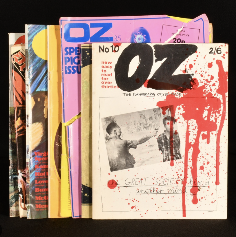
Visually and conceptually, this direction reminded me of the confrontational aesthetic and narrative of Oz magazine in the 1960s; bold, politically charged (feminist!!), and deliberately provocative. That reference made me consider how graphic intervention can function as critique (a starting point for week 2, as this was the project I ended up choosing to develop).
I began asking myself a really interesting question;
What are the repercussions of language on narrative authority?
Perception is different to each individual, even in the most mundane, obvious things; this makes research intricate and inherently biased.
Which led me to;
Why not use my bias to inform others of a different way of knowing?
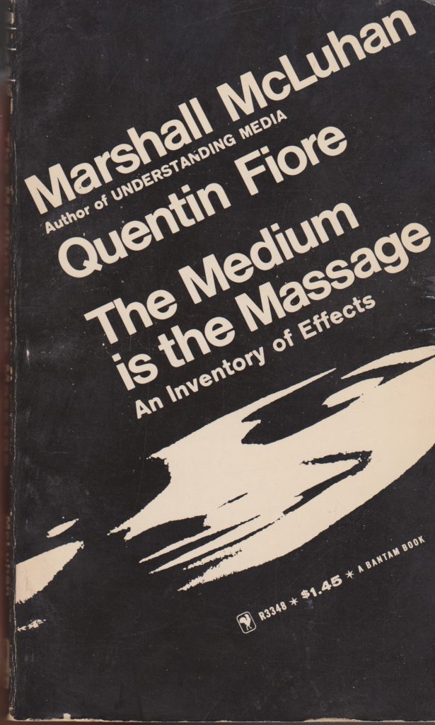
From the initial reading The Medium is the Massage by Marshall McLuhan:
“Have we become deaf, blind and unable to perceive our original ideas?”
“We are so visually biased that we call our wisest men visionaries”
What does it mean to “see” or “experience” a place ?
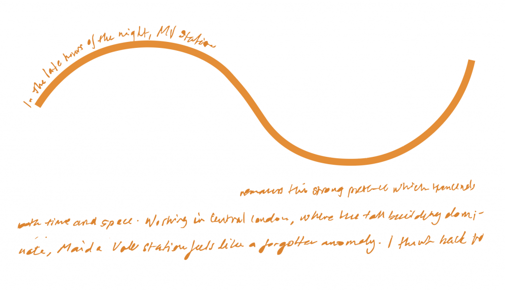
In my investigation, I realised that the sounds and rhythm of Maida Vale are essential constituents in my understanding of the site.
MV exists as both a physical visual site, and a sonic one.
Commuters block sounds out but they choreograph how we move, wait or pass through.
References and Research for this project:
I initially purposely avoided researching the station, keeping my mind open to other ways of investigating. However, the below references strongly influenced my work.
“But it’s just the same in fact, always a self portrait” (Varda A., 2000, 0:33:10)
“We are so visually biased that we call our wisest men visionaries” (McLuhan M., 1967, pp. 117)
Further Research this week:
Further notetaking
Attempted interviewing
Videography
Photography
I found, through my interviews that people did not really pay attention to the station and if they did it was solely the visual aspect of it.
Further inspiration:
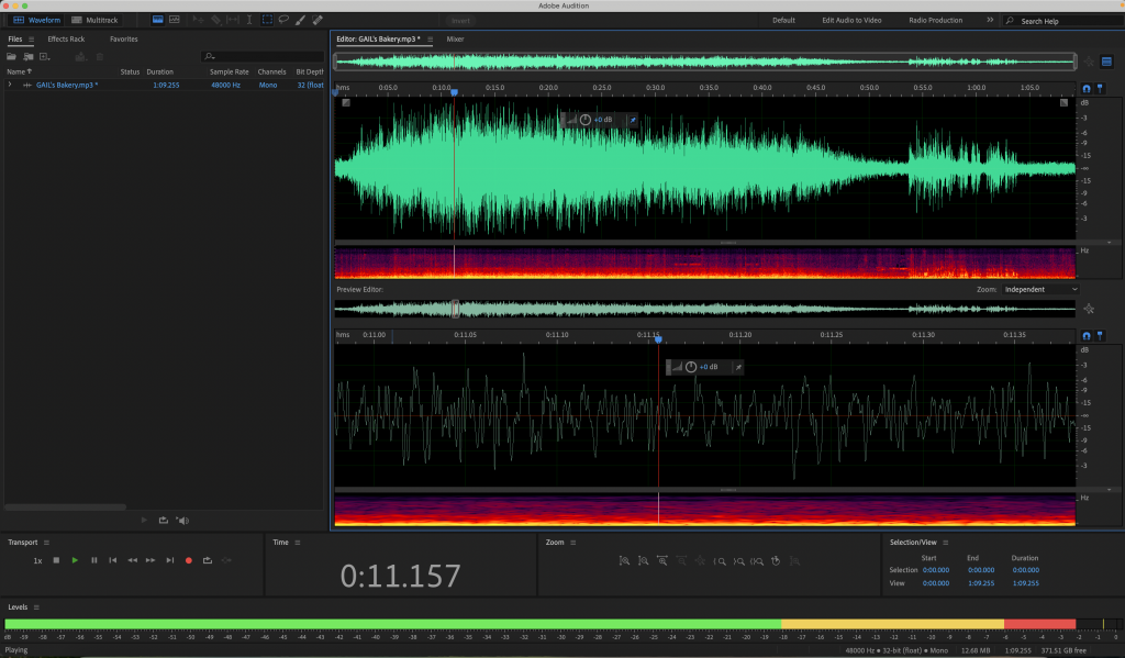
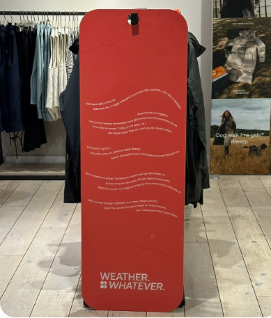
I struggled to find a way in which to superpose my text with the sound and videos/ photos I had taken until I got inspiration from the sweaty betty store in KX I got the idea to explore sound waves and put them on top as such.
As I was working on this project the song Video Killed The Radio Star by The Buggles was stuck in my head. Vision killed sound?
However, after playing around with this idea in After Effects, it was abandoned as it seemed to highlight visuals, instead of bringing the attention of the viewer to the sonic identity of the station.
This distraction aspect was also for case for colour, hence the video became a B&W project.
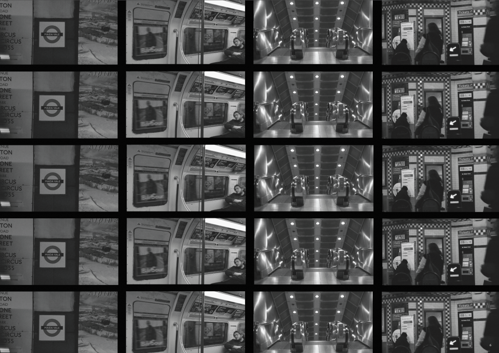
Week 1: Choosing a site to explore and engaging with three methods of investigation
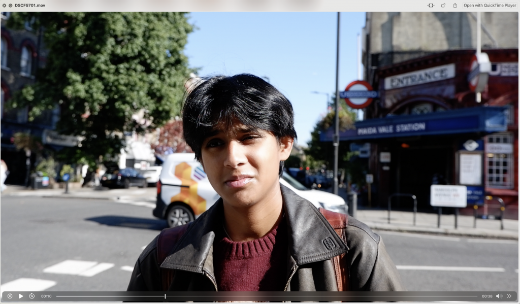
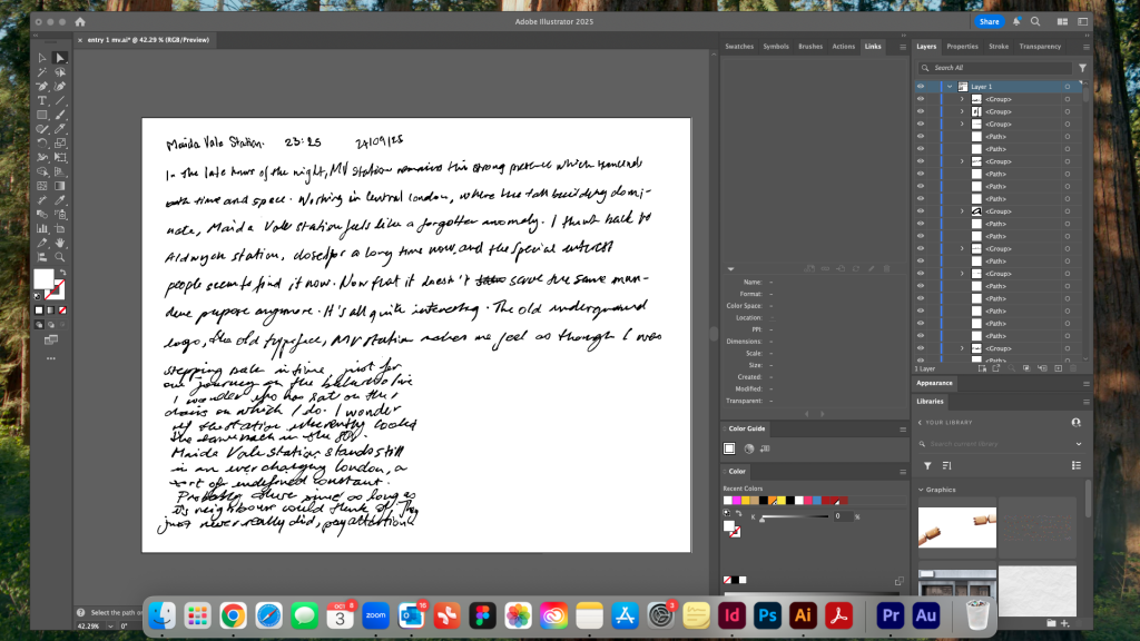
After years of living in East London, I finally moved West.
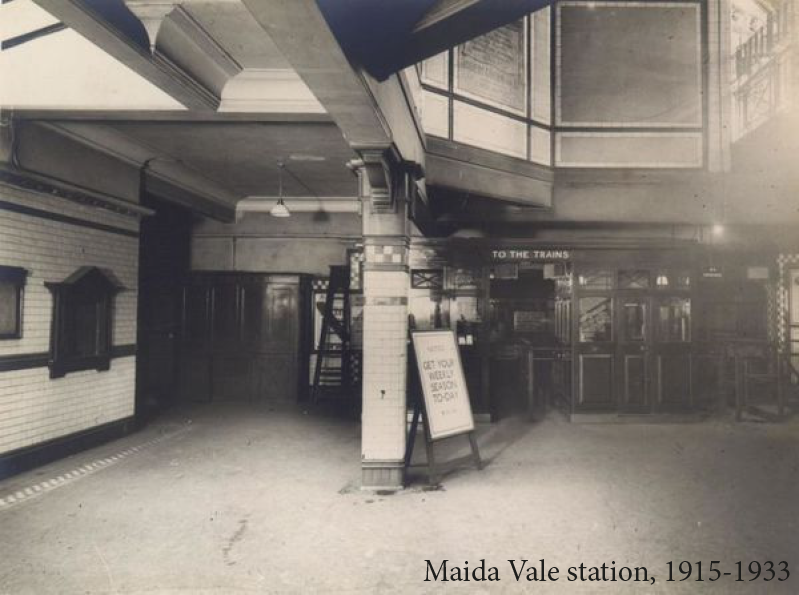
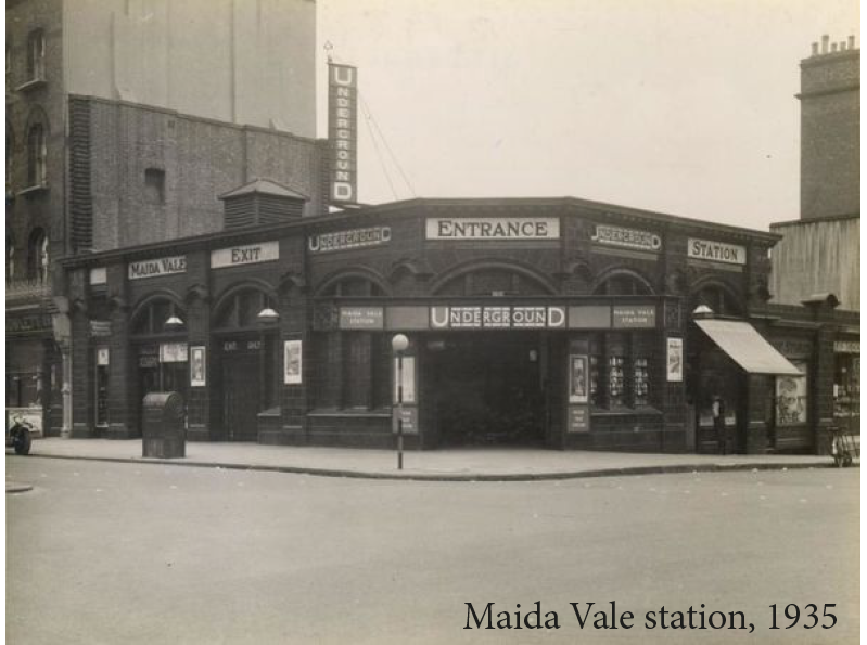
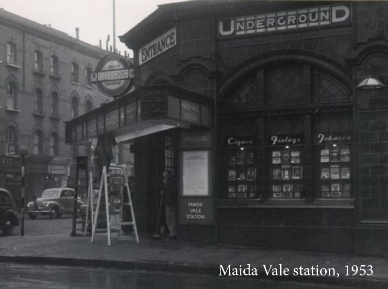
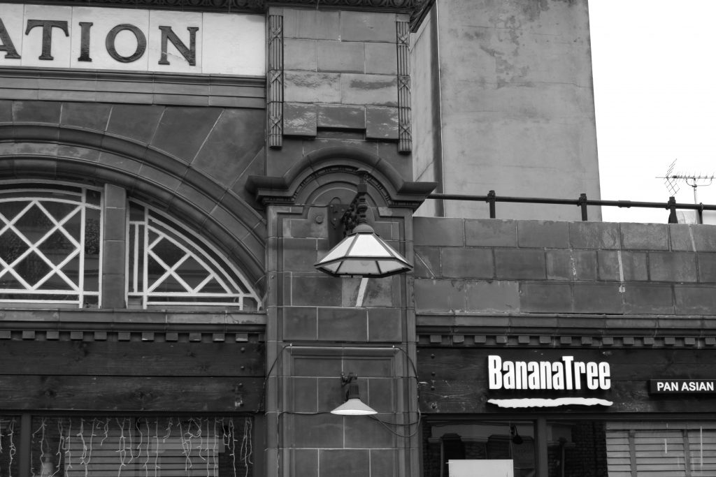
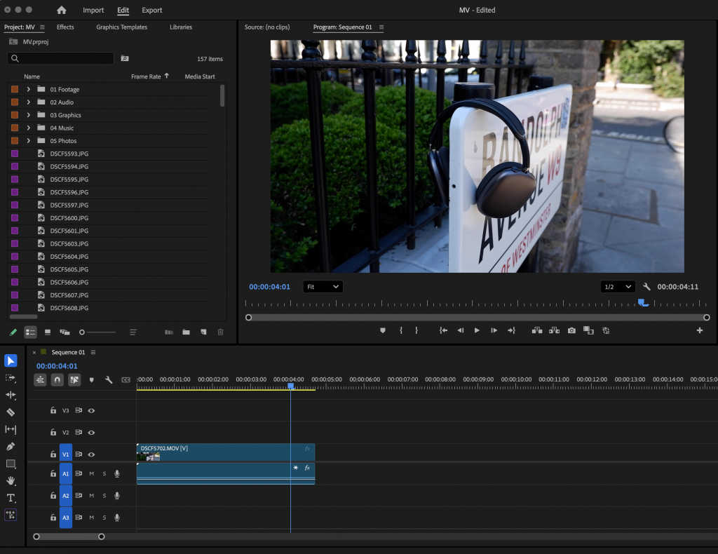
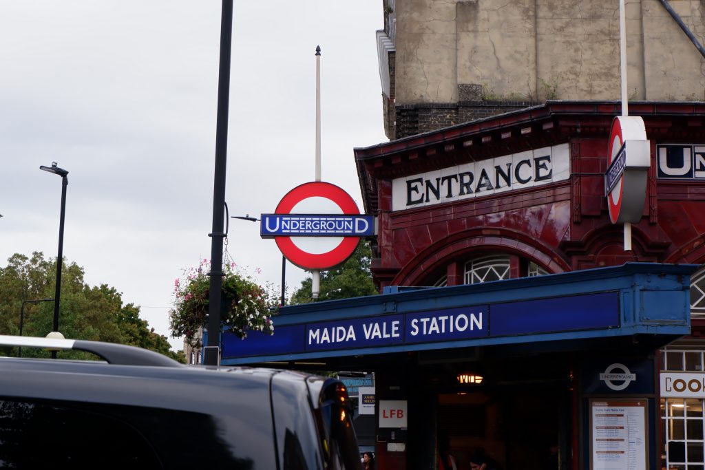
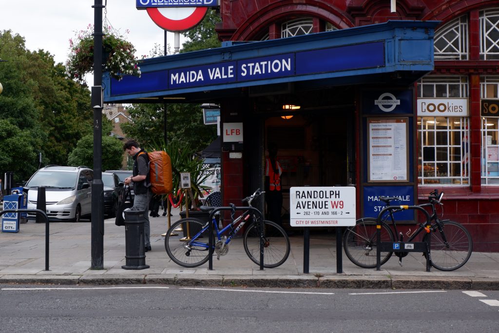
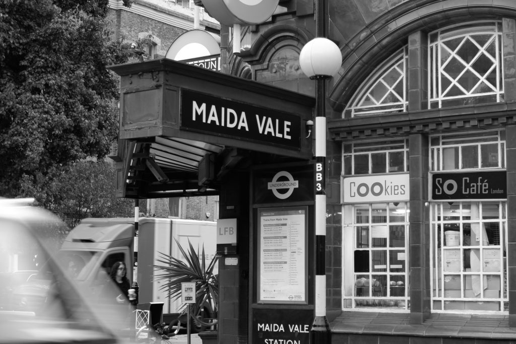
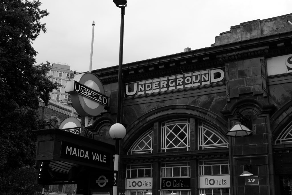
First shot of Maida Vale station, exterior view.
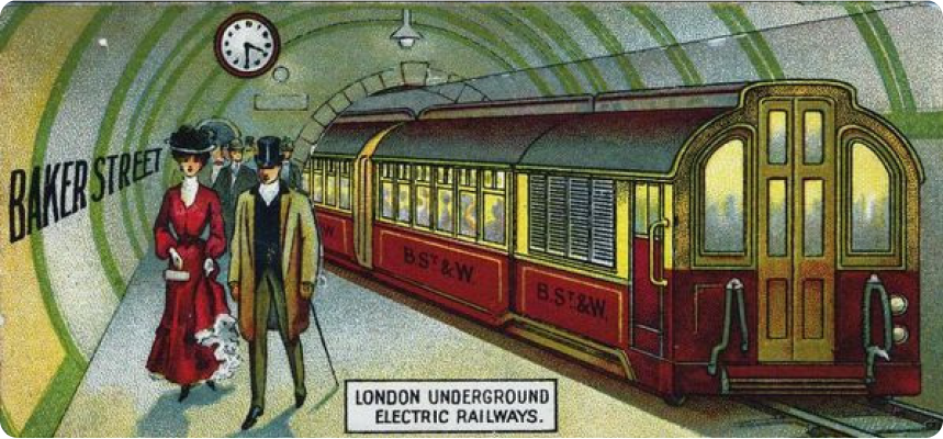
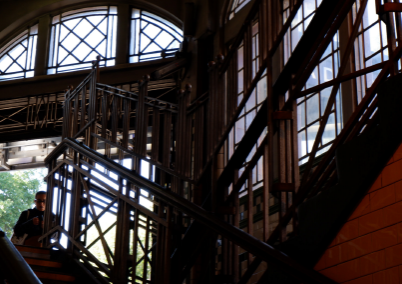
Striking stillness in the ever changing London, MV station sets itself apart. MV caught my eye the first time I went there, for the red tiles and old typeface reminded me of other stations like Covent Garden (or the old Aldwych station on Strand), which almost look out of character for the city we know today.
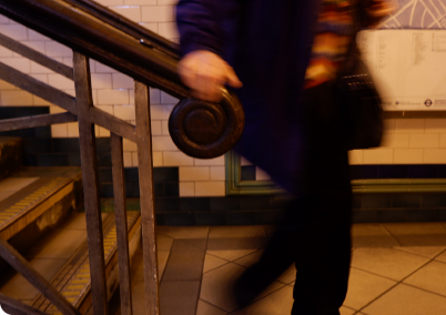
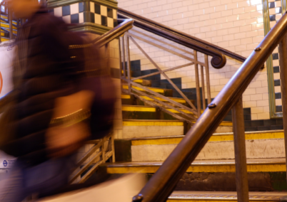
I wanted to capture what felt like a synergy of movement and stillness, so I started shooting it on my camera. Working and attending university means that I’m in central London 5 days a week, always leaving for the intended 9 o ’clock somewhere. Between 8:15 and 8:35, for three consecutive days, I took pictures of the same people, who were probably taking the same route as me but I had never really noticed.
Simultaneously, I started writing every time I walked to MV station, what I noticed. What it would tell me about the place but also its constituents, the people that make it and keep it the way it is. The little details which take so much space in our environment but go un-noticed.
MV despite its physical stillness felt like a never ending loop when I was there, where sounds dictated our commute. The beep of my card at the gates, the sounds of people’s heels tapping the ceramic tiles, my music in my headphones overlaid on the screeching of the train, it all felt like a buzzing place.
I am in fact incapable of taking the tube without my noise canceling headphones, for I find an accumulation of sounds deeply overwhelming. I was really surprised, when I took my headphones off and started to notice, that people (even without headphones) did not seem to pay attention to the sounds. This was deeply intriguing to me, as I could not separate Maida Vale’s visual identity, from its sonic one. I started recording MV and Bakerloo sounds.
I then superposed the music I would be listening to, on top of the tube sounds; showcasing the “sonic world of the commuter”.
It was also interesting to be in my own sonic bubble, paying attention. I took this initial video on my commute, which I thought looked like a dance of commuters.