Chosen set: English Crime and Execution Broadsides
WEEK 1: EXPLORATIONS
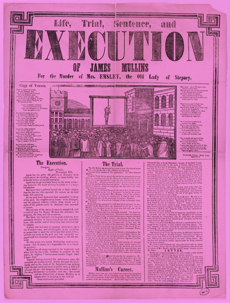
- Execution, execution, execution

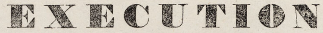
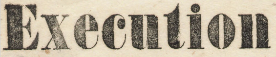
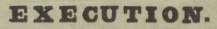
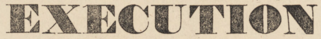
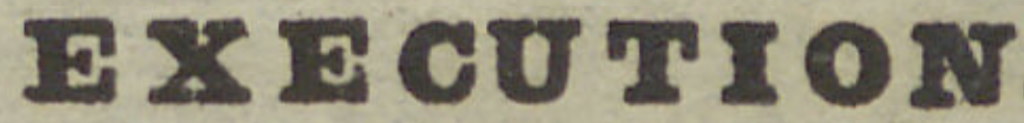
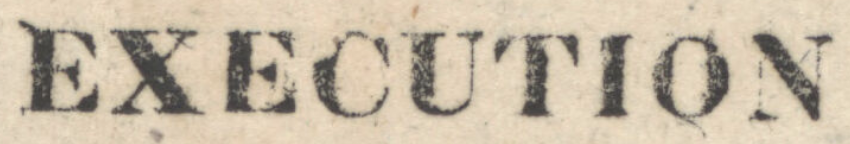
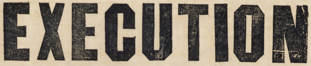
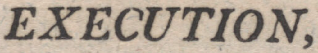
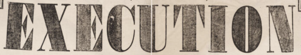
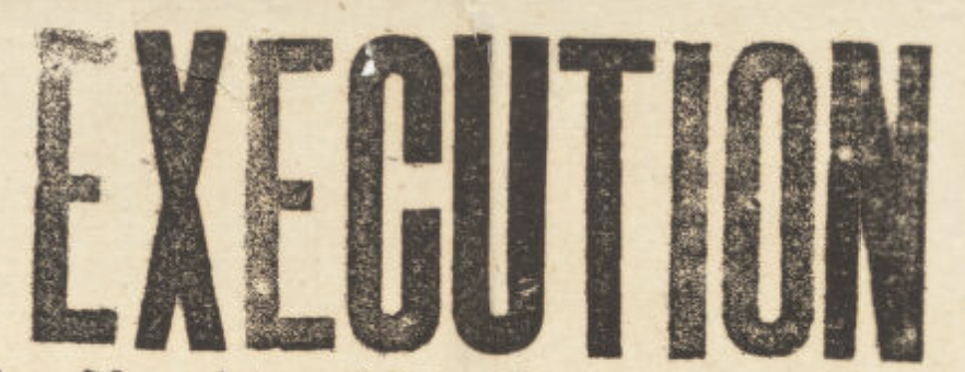
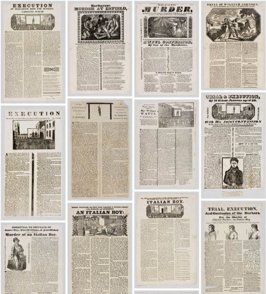
This week began with looking through the broadsides and considering different ways they could be catalogued beyond conventional archival systems. I was immediately drawn to the repeated use of the word “execution.” It appears consistently, but never in exactly the same way. That repetition felt significant both visually and conceptually.
I therefore decided to focus only on the word “execution” as a filtering device. My first step was to scan through a broad selection of broadsides and isolate every instance of the word. Rather than collecting entire posters, I cropped or noted only the typographic look of that single word. This reduction allowed me to treat it almost as a specimen rather than as part of a narrative. I then decided to look into the etymology of the word.
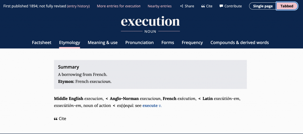
The word execution comes from French, my native language, meaning “passer à l’accomplissement de quelque chose”, which literally translates to “to proceed to accomplish something”. To do. To make. To execute, some-thing.
See at the link below, nine different definitions of the word execution:
https://www.oed.com/dictionary/execution_n?tab=meaning_and_use&tl=true
Execution has many different meanings in itself, yet this collection of “executions” serves as a typographic exploration and cataloguing of England’s 18th Century printmaking techniques.
Going back to my cataloguing…
At first, my selection was intuitive; I picked examples that felt visually distinct. However, as I continued, I realised I needed clearer criteria. I began to categorise them based on:
- Typeface style (serif variations, decorative qualities, weight)
- Scale (how dominant the word was in the composition)
Placement (centred, embedded within text, used as a heading) - Emphasis (boldness, spacing, ornamentation)
By narrowing my focus to one word, I unintentionally created a micro-archive within the archive. The act of repetition shifted from being about content to being about visual rhythm. Through this process, I started noticing patterns; some versions emphasised authority and severity through heavy type, while others blended into dense blocks of text. This experiment became less about the meaning of the word and more about how repetition produces variation. This process taught me that cataloguing can isolate a single element and can generate almost independent meaning through context, however, I decided to go forward with a different idea, as this one felt rather limited in creative potential.
2. Alt-text and braille
For the second experiment, I shifted my attention from visual dominance to accessibility. Instead of cataloguing through sight alone, I asked: How might these broadsides be experienced without vision? On their respective information pages, each broadside includes a set of notes, including a vivid alt-text–like description of the engraving, each carefully written. Alt-text exists to make digital content accessible to people using screen readers.
I began by reading the existing alt-text descriptions of selected posters. They were surprisingly detailed, almost literary in tone. I then attempted to write my own versions. Very quickly, I realised my first attempts were overly descriptive; I tried to include everything. But what is everything? This made me understand that description itself requires editing and hierarchy. I had to decide:
- What is atmospheric (tone, emotional weight)?
- What information is essential?
- What is structural (layout, typography)?
- What is narrative (the story of the crime)?
Through rewriting and comparing my descriptions with the originals, I began to see alt-text as an interpretative act in its own right. It is not neutral. It prioritises certain details, creates emphasis, and inevitably leaves things out. In trying to make the image accessible, I was also reshaping it.
From there, I considered braille as a physical extension of this method. I researched basic braille translation conventions and began imagining how these dense visual posters might translate into tactile text. That shift exposed how much of the broadsides’ authority and drama come from scale, ornamentation, and typographic hierarchy; qualities that largely disappear in braille.
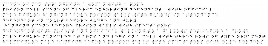
My aim became to enhance the accessibility of the collection by developing a catalogue built entirely from detailed alt-text descriptions, which could then be translated into braille. I began compiling selected engraving descriptions, such as:
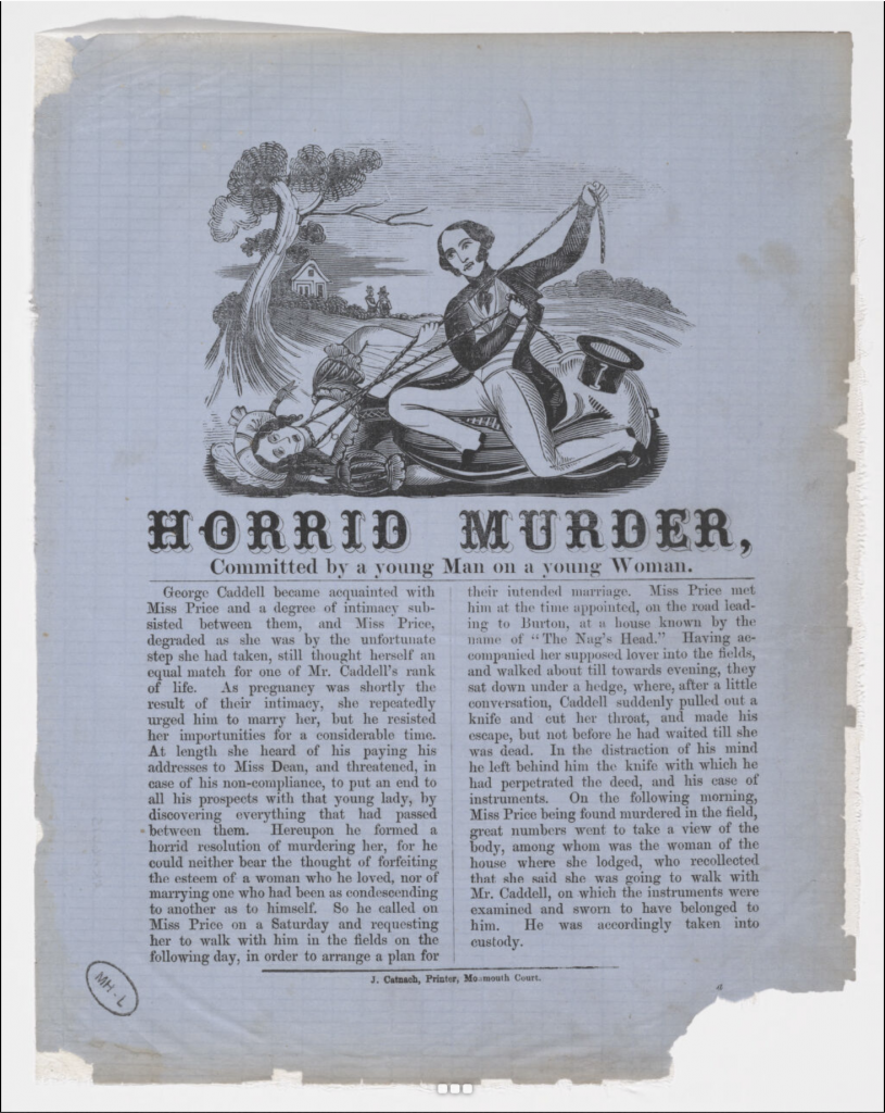
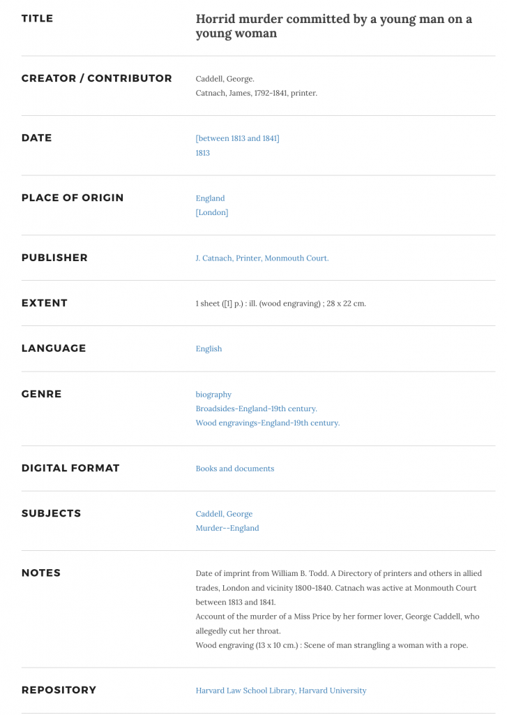
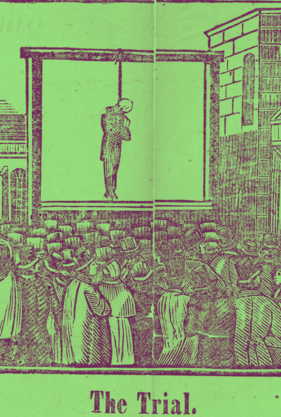
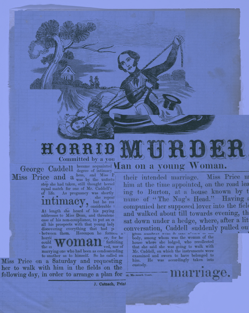
- Wood engraving (13 x 10 cm.) : Scene of man strangling a woman with a rope.
- Wood engraving (8.5 x 10.5 cm.) : Prison cell scene of cleric exhorting defendant, with official.
- Wood engraving (8.5 x 17.5 cm.) : Male figure, hanging above prison walls, with guards in attendance.
- Wood engraving (14 x 23 cm.) : Defendant in court before judge and jury.
- Wood engraving (13.5 x 17 cm.) : Hanging scene before prison walls, with spectators.
- Wood engraving (9 x 19 cm.) : Defendant, with priest and official, walking to a gallows set before a crowd.
- Wood engraving (8.3 x 7 cm.) : Male figure, manicled at arms and legs, in a cell. With three rows of type ornament.
- Wood engraving (6 x 16 cm.) : Half-figure male, hanging before prison walls with spectators. With rule borders.
Which in braille would be simply translated as;
In this sense, these Braille descriptions would be reduced to tactile text without scale, ornament, or visual hierarchy. That reduction interested me as it stripped the broadsides back to narrative and action.
I wanted to take this further by producing a physical collection of broadside alt-texts, printed on plastic sheets to allow for braille embossing and durability. The idea was to create a parallel archive: one that could be handled and read differently.
This process raised a broader question for me: are cataloguing systems fundamentally built around sight?
By reframing the broadsides through accessibility, I was not just describing them; I was questioning what is preserved and what is not when format changes. The experiment then shifted from description to critique. It became less about transcription and more about exposing the assumptions embedded in conventional archival systems.
During the crit, this proposal was met with some (understandable) criticism. Because of the violent nature of the broadsides, the translation into braille was seen by some as potentially unsettling or inappropriate. I did not fully share that view, but I decided to pause the idea for now.
Still, the possibility of working with braille as a material and conceptual medium has stayed with me. I think it holds real potential for a future project.
3. Hijacking
The third experiment moved into reinterpretation. I began to “hijack” elements of the broadsides by deliberately altering them to see how meaning would shift.
At first, my approach was intuitive. I removed or repositioned certain textual components and simply observed what changed. However, I quickly realised that if I wanted this to function as a method rather than just visual play, I needed clearer intervention rules.
I began applying structured alterations such as:
- Removing all body text and keeping only the headline
- Changing the colour of the broadside
- Rearranging typographic hierarchy
- Cropping out names while keeping the crime descriptions
Instead of changing everything at once, I altered one element at a time. This made it easier to see cause and effect.
Each alteration produced a very different reading. When the name was removed, the crime became abstract and almost anonymous. When the decorative border remained without text, the poster shifted from being informational to ornamental. When hierarchy was reversed, minor details suddenly felt central.
(Few examples:)
Through this process, I realised that meaning in these broadsides is interestingly not fixed, it is constructed through composition. Authority comes from structure: scale, placement, naming, sequencing. Once those systems are disrupted, the narrative is too. What started as playful experimentation gradually became a way of testing structural dependence.
As I looked closer, I also became aware of how strongly the language reflects patriarchal systems (which I suppose makes sense for the 18th Century). Many of the cases describe violence against women, often framed in moralising or sensational terms. I noticed that a large number of the murders were femicides, yet the narrative frequently centres male authority such as executioners, husbands, fathers, judges, priests, rather than the women themselves.
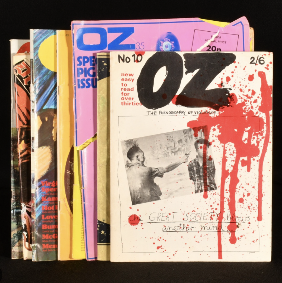
Visually and conceptually, this direction reminded me of the confrontational aesthetic and narrative of Oz magazine in the 1960s; bold, politically charged (feminist!!), and deliberately provocative. That reference made me consider how graphic intervention can function as critique (a starting point for week 2, as this was the project I ended up choosing to develop).
I began asking myself a really interesting question;
- What are the repercussions of language on narrative authority?
That’s it for week 1.
Leave a Reply